Japandi interior design: the calm home, and the art that belongs on its walls
Japandi blends Japanese wabi-sabi with Scandinavian warmth. This guide covers the palette, the materials, the classic mistakes — and the one thing most guides skip: what actually belongs on a Japandi wall.
Japandi interior design is what happens when two of the world's most disciplined design cultures agree on almost everything. Japanese minimalism brings the reverence for imperfection and empty space; Scandinavian design brings the warmth, the light woods, the insistence that a home should be lived in, not looked at.
The result is a style that feels less like a trend and more like a truce with your own stuff. Most guides will walk you through the sofa, the palette, the flooring — and then fall silent at the walls. That silence is exactly where this guide goes: what art belongs in a Japandi home, how much of it, and how to hang it without breaking the spell.
What is Japandi interior design?
Japandi is a hybrid of two philosophies that were circling each other for a century before anyone gave the pairing a name. From Japan comes wabi-sabi — the acceptance of imperfection and impermanence, the beauty of a bowl that shows its making. From Scandinavia comes functionalism softened by hygge: pale woods, honest craft, and comfort treated as a design requirement rather than an afterthought.
Where pure Japanese minimalism can read as austere and pure Scandi can drift into cosy clutter, Japandi holds the middle. Rooms are spare but never cold. Every object earns its place, and the space between objects is treated as part of the composition — not as emptiness waiting to be filled.
That last idea is the key to the whole style. In a Japandi room, negative space is a material. You'll see it in the low furniture that leaves walls breathing above it, in the single branch in a vase instead of the full bouquet, and — as we'll get to — in walls that hold one considered piece of art rather than twelve.
The Japandi palette: colours and materials that carry the style
The Japandi colour palette is warm, muted and low-contrast. Start from a base of soft neutrals — ivory, oat, warm greige, mushroom — and layer in earth tones: clay, sand, moss, olive. Then anchor the scheme with one grounding dark: charcoal, espresso, or the near-black of stained ash. That single dark note is what separates Japandi from generic beige minimalism; it gives the eye somewhere to rest and the room a quiet spine.
What you won't find are brights, high-gloss finishes, or hard white. Japandi white is always warmed — think rice paper, not printer paper. Colour arrives through material rather than paint: the green of a potted plant, the rust of an unglazed pot, the grey of stone.
Materials do most of the talking. Light oak and ash for the big pieces, with darker walnut or black-stained wood as punctuation. Linen and cotton in loose weaves. Stone, paper, bamboo, rattan, wool. Ceramics with visible texture — a hand-thrown vase beats a factory-perfect one precisely because it is imperfect. If a surface is shiny, plasticky or pretending to be something it isn't, it's fighting the style.
Underfoot, the same logic applies: light-to-mid woods — oak, ash or bamboo — in a matte or oiled finish, or warm-toned stone softened with a woven rug. Avoid high-gloss floors and very red woods, which fight the muted palette.
Wall art for Japandi walls: restraint is the point
Here is where most Japandi guides stop short, and where most real-world attempts fall apart. People perfect the furniture, then hang art the way they always have — a busy gallery wall, a bold statement print, a matching set of three — and wonder why the room stopped feeling calm.
Japandi treats a wall the way a Japanese scroll painting treats paper: the empty area is part of the work. One well-chosen piece with generous clearance around it will always beat five competing ones. If a wall already has a window, a shelf, or strong architecture, it may need no art at all — and deciding that is itself a design decision.
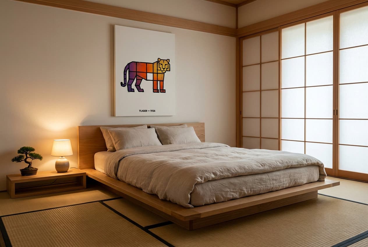
What kinds of art work? Look for pieces that share the room's DNA:
- Ink-wash and line work. Sumi-e-inspired brushwork, a single continuous line, calligraphic gestures. These carry the Japanese half of the style directly.
- Quiet botanicals. A single stem, a study of grasses or seed heads, muted watercolours — nature observed closely rather than dramatised.
- Soft geometry. Arcs, circles and horizon lines in clay, sand and charcoal tones nod to the Scandinavian half without shouting.
- Muted landscapes. Fog, mountains, water — scenes with more atmosphere than detail.
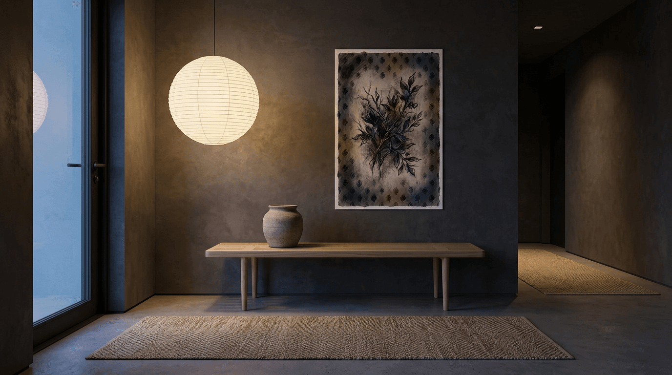
The common thread is breathing room inside the image itself. Browse minimalist posters with this filter in mind: if the composition has generous empty space and a palette that could be mixed from the room's own materials, it will settle in. If it needs attention, it won't.
A concrete example of the register that works — a restrained botanical study in muted tones, more suggestion than statement:
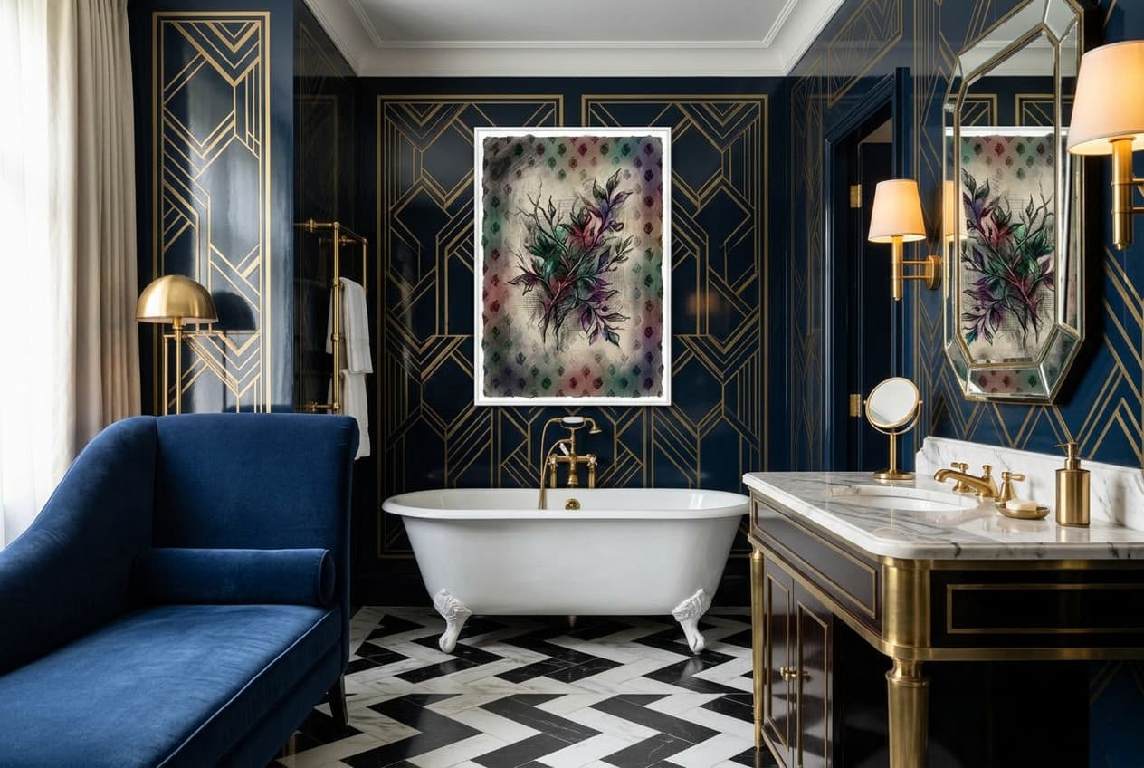
And if all this restraint sounds like a punishment, it may simply be the wrong style for you — our guide to Art Deco interior design offers a different kind of discipline with glamour.
How to choose, size and place Japandi wall art
Once you know what to hang, the remaining decisions are format, size and height — and Japandi has opinions on all three.
Paper or canvas? A paper poster in a thin black or white wood frame is the most Japandi-native choice: the slim frame reads as a quiet line, close cousin to the black-stained wood accents elsewhere in the room. Stretched canvas works beautifully too, especially frameless — its soft matte texture suits the style's honest-materials ethos, and the absence of any frame at all is about as wabi-sabi as wall decor gets.
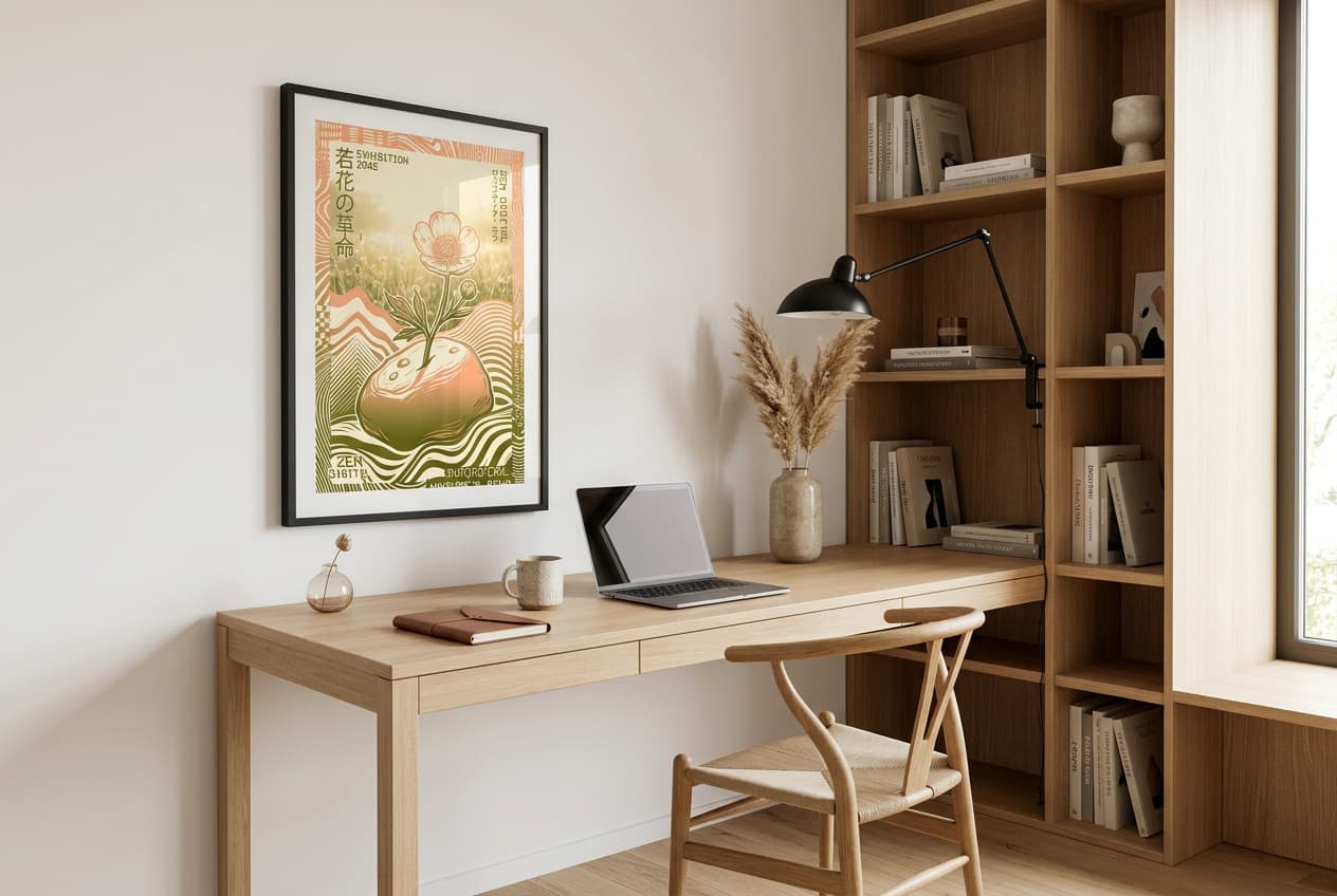
Size for the wall, not the sofa. Japandi furniture sits low, which leaves unusually tall wall space above it. A piece that's too small gets lost in all that air. Above a sofa or a low sideboard, go generous — 50×75, 60×90 or 61×91 cm — and let the emptiness around the piece do the framing. Smaller formats like 20×30 or 30×45 cm belong in tighter spots: a hallway, a nook, the wall beside a doorway, or hung as a loose pair with real space between them.
Hang lower than you think. Because the furniture is low, art hung at standard gallery height can look like it's floating away from the room. Let the piece relate to the furniture beneath it — a hand-width or two above a sideboard or headboard usually feels anchored. When in doubt, cut the size out of paper, tape it up, and live with it for a day. Japandi rewards slow decisions.
Japandi room by room
Living room. This is where the single-statement rule matters most, because it's the room with the most competing surfaces. Keep the seating low and the wall above it mostly empty except for one large piece. When choosing posters for living room, favour horizontal or gently vertical compositions that echo the long, low lines of the furniture. One plant, one lamp with a paper or linen shade, and stop.
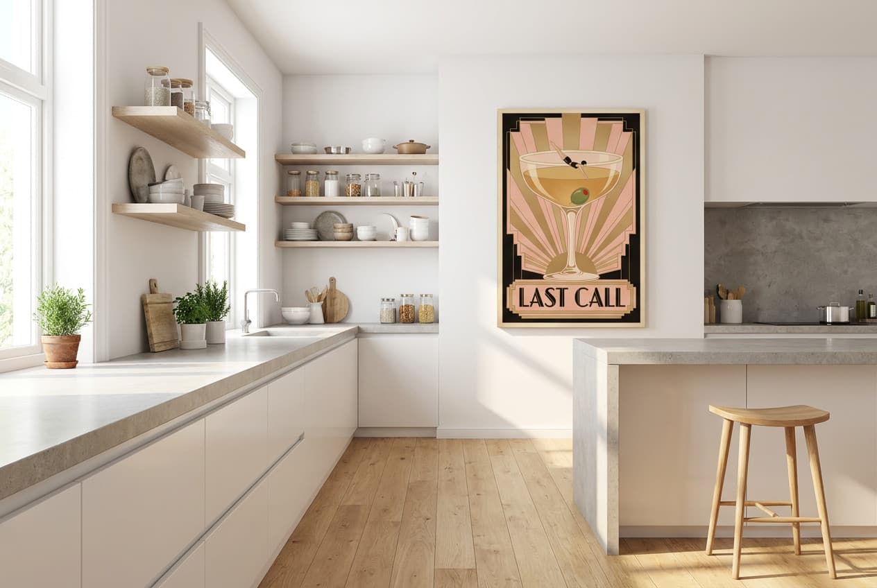
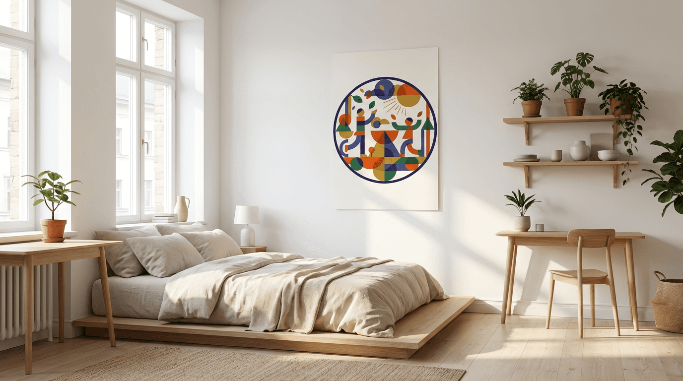
Bedroom. The Japandi bedroom is the style's natural habitat: a low platform bed, layered linen in oat and clay, and a single calm piece above the headboard. A frameless canvas is ideal here — no glass to catch lamplight, no hard frame edge above your head. Among canvas prints for bedroom, look for the most atmospheric, least literal image you can find; the bedroom is the one room where art should work at a whisper.
Kitchen and dining. Japandi kitchens are matte, handle-less and wood-fronted, which leaves them at risk of feeling clinical. One modest artwork — a 20×30 or 30×45 cm piece on a shelf or a sliver of free wall — restores warmth without cluttering a working room. Browse canvas prints for kitchen for something with an earthy palette; canvas shrugs off kitchen humidity better than unframed paper.
Common Japandi mistakes (and how to avoid them)
Confusing minimal with cold. Strip a room to nothing and you get a waiting area, not wabi-sabi. If your Japandi room feels bleak, the fix is texture, not stuff: a wool throw, a coarse linen curtain, one more warm wood tone.
Buying in matching sets. Three identical prints in identical frames, a fully coordinated furniture line — matching reads as manufactured, and Japandi is allergic to manufactured. Pieces should look gathered over time, related by palette rather than by barcode.
Clutter creep. The style fails slowly, one harmless object at a time. The Japanese habit worth stealing is rotation: keep a few beautiful things out, store the rest, and swap seasonally. The wall version of this rule: one wall, one work.
Fake materials. Plastic rattan, printed wood grain, faux linen — Japandi's whole argument is material honesty, and imitations undermine it faster than any layout mistake.
Fighting your own taste. If you keep sneaking in ornament and drama, listen to yourself. Art Deco interior design offers discipline with glamour, and Dark Academia decor offers moodiness with soul. A style you'll actually maintain beats a style you admire in photos.
Bring the calm home
Japandi interior design is ultimately an editing discipline: warm materials, muted colour, and the confidence to leave space empty. Get the palette right, choose furniture that sits low and honest, and then give your walls the same respect — one piece with room to breathe, sized generously, hung low, chosen because it could have been mixed from the room's own materials.
Start with the wall you see most often. Take everything off it, live with the emptiness for a week, and then add back exactly one thing you love. That single decision, repeated room by room, is the entire style.