Studio wall decor: Ideas to enlarge and style your small space
Transform your studio into an elegant and functional living space. Explore our best wall decor strategies tailored for small apartments.
Living in a studio doesn't mean giving up an interior that reflects who you are. On the contrary, every square meter counts double when it comes to creating a warm and personal atmosphere. Studio wall decor becomes your best ally: it structures the space, creates distinct visual zones, and transforms four white walls into a cocoon that tells your story. In this guide, you'll discover how to choose, arrange, and compose your wall decorations to maximize visual impact without overwhelming your small space—from composition rules to layout tips, including styles that really work in 20-30 m².
Why wall decor is crucial in a studio
In a 20-30 m² studio, your walls represent the largest continuous visual surface in your space. Unlike compartmentalized apartments, where each room has its own identity, the studio requires everything to coexist in a single volume. This is precisely where wall decor becomes your most powerful ally: it visually structures the space without erecting physical partitions, creates distinct psychological zones, and transforms four white walls into a place that truly reflects you.
Wall decor as a spatial structuring tool
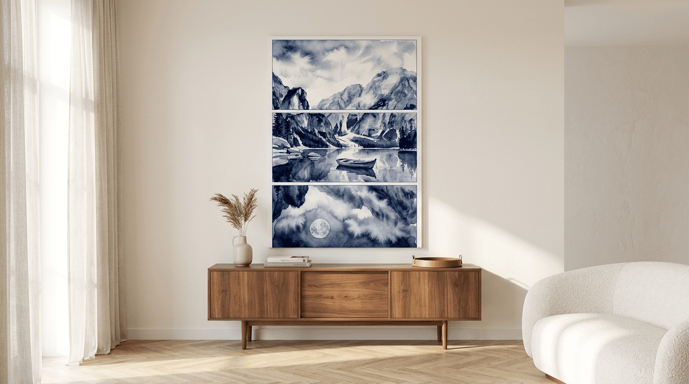
A bare wall in a studio is a missed opportunity. By hanging escape into breathtaking landscapes above your sofa bed, you instantly define a living area. A series of graphic posters in the dining zone visually signals "this is where we eat" without needing a bulky divider. This visual segmentation helps your brain switch between lifestyles—relaxation, work, rest—even if you're technically staying in the same room.
Daily emotional impact
Living in a small space can quickly become suffocating if the environment remains impersonal. Intentionally decorated walls radically change your perception: they tell your story, reflect your passions, and transform a simple functional dwelling into a personal sanctuary. A well-chosen poster captures natural light differently depending on the time of day, creating an evolving ambiance that punctuates your day and combats spatial monotony.
Using light colors and mirrors to expand space
In a studio, every chromatic decision directly influences the perception of space. Light colors act as visual amplifiers: they reflect natural light and create an impression of openness that dark shades absorb. This strategy becomes particularly powerful when applied to both the walls AND the wall decor itself.
Minimalist and soothing color palette
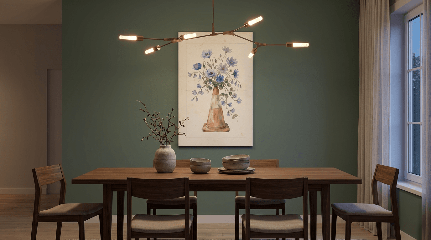
Off-white, pearl gray, and powdery pastels (pale pink, sky blue, mint green) form the ideal foundation for expansive wall decor. These shades create a neutral backdrop that allows nature posters or canvases to breathe without visual competition. A poster in soft tones—think misty landscapes or minimalist botanical compositions—extends this palette while adding character.
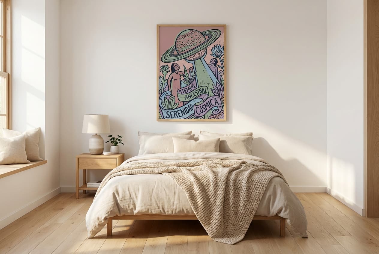
The trick is to limit your palette to three shades maximum: a dominant light tone (80% of your walls), a neutral secondary (15% through your textiles), and a subtle accent (5% in your wall art). This 80-15-5 rule avoids visual cacophony that optically shrinks the space. Monochrome or light-dominant posters naturally integrate into this scheme without weighing down the room.
Strategically placed mirrors: space multipliers
A well-positioned mirror literally doubles your perceived space. Place it facing a window to capture and redistribute natural light into the darker areas of your studio. Avoid placing it facing visually cluttered elements (messy desk, full shelves)—it would amplify the disorder.
The mirror-poster combination creates a particularly effective dynamic: install a large vertical mirror on a side wall, then arrange medium-sized posters on the adjacent wall. The mirror will partially reflect your artwork, creating a virtual gallery that enriches the visual experience. This technique works particularly well in dining areas or workspaces, where the mirror adds depth behind you while reflecting the wall decorations from the opposite zone.
DIY wall decor: creating character on a budget
A studio's limited budget should never be a barrier to personalization. DIY projects transform anonymous white walls into expressive surfaces for a few dozen dollars, while offering creative satisfaction that ready-made purchases never provide. The advantage of handmade also lies in its adaptability: each project adjusts precisely to the dimensions and constraints of your space.
Wall painting and stencils
A painted wall section in a contrasting shade instantly creates a focal point that structures the space. In a 25 m² studio, limit yourself to a single accent wall—the one behind the sofa bed or dining area—in an earthy tone (terracotta, sage green, navy blue) that dialogues with your textiles. Geometric stencils add rhythm without commitment: half-tone hexagonal patterns, plant friezes along a beam, or a simple horizontal line at mid-height that visually widens the room. Material cost: €30-50 for paint and reusable stencils.
Frames and personalized prints
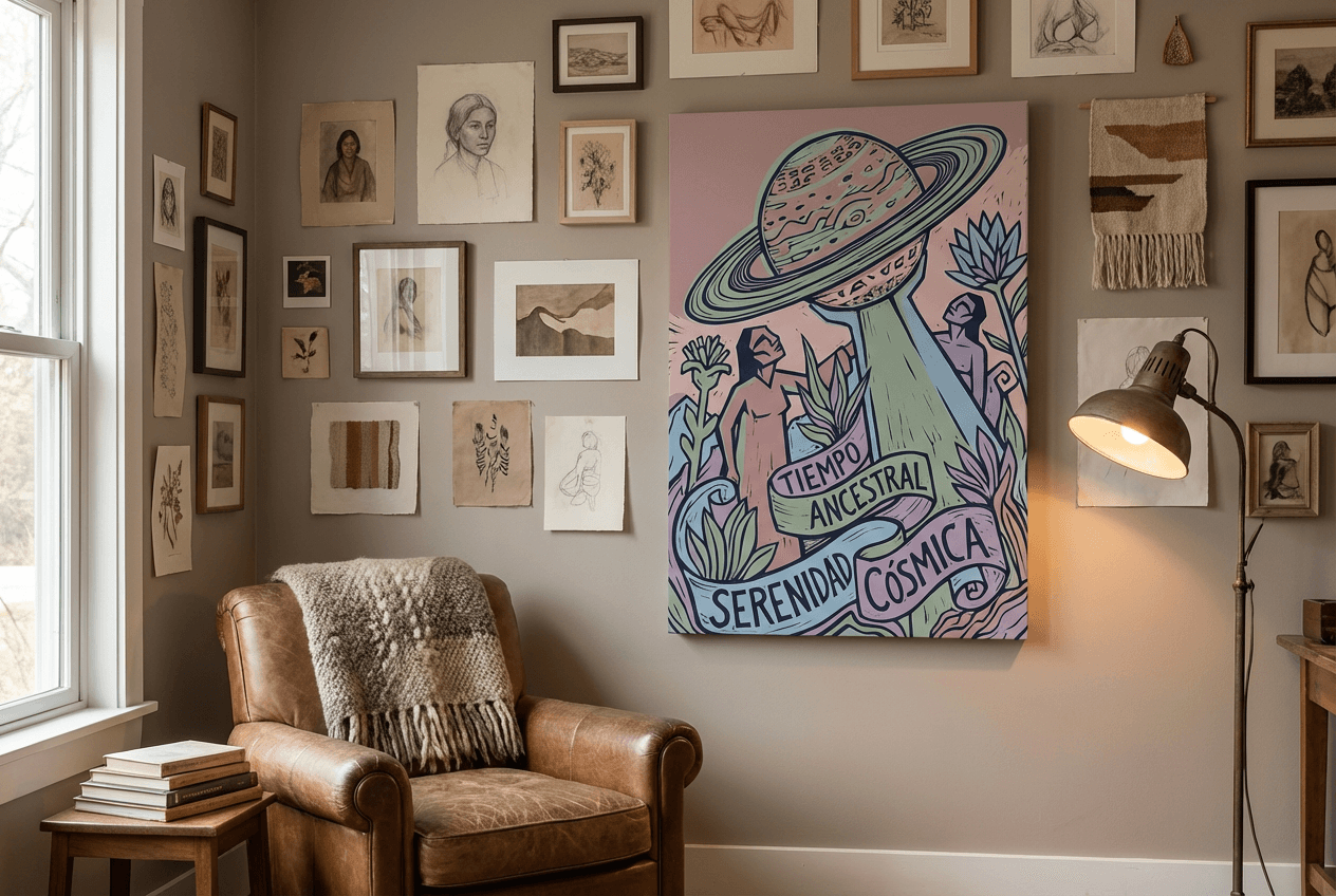
The DIY wall gallery combines thrifted frames (flea markets, thrift stores) and personal prints—travel photos, postcards, cut-out magazine pages. The trick: unify mismatched frames with identical matte paint (black, white, gold) to create visual cohesion. Arrange them on the floor before drilling, maintaining 5-8 cm of spacing between each element. For maximum impact, mix formats and orientations while keeping a guiding line (alignment of top edges or common central axis). Incorporate one or two quality nature posters that anchor the composition and elevate the whole.
Floating shelves as functional decor
Wall shelves solve the studio's impossible equation: decorating while storing. Three 60 cm light wood shelves, arranged in a staggered pattern above the desk, accommodate books, succulents, and small frames—creating a three-dimensional tableau that evolves with the seasons. Alternate vertical objects (thin vases, candlesticks) and horizontal ones (stacked books, flat boxes) for balanced visual rhythm. Untreated raw wood costs €15-20 per linear meter and mounts with invisible brackets for a suspended effect. This verticality frees up lower surfaces while generously dressing the wall.
Paintings, prints, and posters: transforming your walls into a gallery
The framed print or stretched canvas remains the most accessible way to create immediate visual impact in a studio. Unlike decorative objects that occupy precious surfaces, a well-chosen poster transforms a bare wall into a focal point without sacrificing a single square centimeter of floor space. The key? Think overall composition rather than accumulation of disparate images.
Cohesive wall gallery composition
A successful wall gallery in a studio follows the rule of three: three sizes maximum, three dominant colors, three visually compatible themes. Start with an A2 or 50×70 cm format as the central anchor, then add two smaller formats (A3 or 30×45 cm) arranged in an asymmetrical triangle. The ideal spacing? 5 to 8 cm between each piece—enough for each work to breathe, tight enough to create visual unity.
For studios with limited wall space, favor a horizontal line arrangement at eye level (about 145-150 cm from floor to center of artwork). This configuration visually lengthens the room and guides the eye without fragmenting the space. Avoid perfectly symmetrical grids that freeze the atmosphere: a slight vertical offset between three posters creates discreet dynamism.
Themes and styles suited to small spaces
Small spaces demand visuals that open rather than confine. Aerial landscapes, ocean horizons, and botanical compositions bring illusory depth—a misty forest or minimalist desert creates a mental window to the outside. Geometric abstractions in neutral tones structure without weighing down, while minimalist line art adds sophistication with a light visual footprint.
Color-wise, harmonize your posters with your existing palette: if your textiles are beige and terracotta, look for works incorporating these shades with an accent of sage green or powder blue. A monochrome studio tolerates a bolder print—mustard yellow or brick red—that becomes the room's exclamation point.
Minimalist framing to avoid clutter
In a studio, the frame should fade before the artwork. Thin moldings in natural wood (light oak, ash) or matte black aluminum create a polished finish without visually competing with the poster. For tight budgets, simple poster clips or magnetic hangers offer a clean Scandinavian aesthetic while facilitating seasonal rotations.
Canvases stretched on frames completely eliminate the framing question—their 2-3 cm depth is enough to create subtle relief that catches raking light. For maximum cohesion, limit yourself to one type of finish per wall: either all framed, all canvas, or all minimalist suspension. This uniformity creates an impression of intentional collection rather than random accumulation.
3D wall decor and suspended objects: adding depth
Flat surfaces can make a studio visually monotonous. By adding three-dimensional elements, you create shadow and light play that energizes the space without encroaching on precious floor space. Visual depth combats the typical "box" effect of small spaces.
3D objects and wall sculptures
Lightweight wall sculptures in paper, cardboard, or wood bring relief without weighing down. Favor pieces of 20-40 cm maximum to avoid visual crushing. Geometric or organic creations (paper birds, abstract metal shapes) capture natural light and create changing shadows throughout the day. Position them near a window or next to a poster to create dialogue between flat and volumetric. Thin wall shelves (10-15 cm deep) serve as both storage and support for mini-sculptures or figurines that personalize without cluttering.
Hanging plants and floating shelves
Climbing or trailing plants (pothos, ivy, string of hearts) add life and vertical movement. Suspended at different heights near a poster composition, they create an organic ensemble that softens straight lines. Staggered floating shelves in a staggered pattern generate upward dynamics while freeing the floor. Alternate decorative objects and small plants on three levels maximum to avoid visual overload. This stratification creates a three-dimensional gallery that enriches the experience without reducing circulation space.
Aesthetic acoustic panels
In a studio where all sounds reverberate, decorative acoustic panels combine function and aesthetics. Available in felt, textured foam, or perforated wood, they absorb noise while adding wall relief. Choose neutral tones (light gray, beige, soft terracotta) that harmonize with your existing posters. Arranged in asymmetrical composition above the sofa or behind the work space, they visually structure the zone while improving acoustic comfort—a precious asset when living room, bedroom, and office coexist in 25 m².
Wall lighting: creating ambiance without clutter
Wall lighting represents one of the most underestimated levers in a studio. Unlike floor lamps that consume precious floor space, wall-mounted fixtures free up space while sculpting the atmosphere. A well-lit studio instantly appears more spacious, warmer, and especially more adaptable according to times of day. The trick? Layer multiple light sources at variable intensity rather than relying on an aggressive central ceiling fixture.
Minimalist wall sconces
Contemporary sconces in brushed metal or frosted glass diffuse soft light without creating a heavy focal point. Install them at 1.8 m height on each side of a sofa bed or above a desk for functional lighting that frees up the work surface. Articulated arm models offer precious flexibility: direct light toward the wall for a soothing indirect effect in the evening, then redirect it toward your book or keyboard as needed. Favor warm white LED bulbs (2700-3000K) that consume 85% less energy than halogens while creating a welcoming ambiance.
LED strips and indirect lighting
Self-adhesive LED strips transform any wall shelf or cornice into an architectural light source. Hidden behind a large-format poster or under a floating shelf, they create a luminous halo that visually detaches the element from the wall and adds spectacular depth. RGB versions allow you to change the ambiance with a simple smartphone gesture: energizing blue-white light for working, amber tones for evenings. Installation cost? Less than €30 for 3 meters, with a lifespan of 25,000 hours.
Light play to visually enlarge
Upward lighting (directed toward the ceiling) visually raises ceiling height by creating the illusion of airy volume. Combine this technique with targeted downward lighting on your posters or canvases to create light layers that guide the eye and structure the space. A 25 m² studio easily gains 20% perceived volume through this intelligent light stratification.
Maximizing functional zones with wall decor
In a studio, walls become invisible structuring tools. Rather than installing partitions that reduce space and light, wall decor allows you to create psychologically distinct zones while preserving visual fluidity. This approach transforms a single room into a set of clearly identified functional spaces, without losing a single square centimeter.
Delimiting sleeping and living spaces
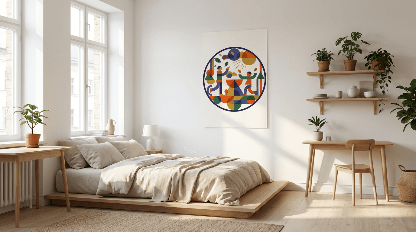
Visual separation between the sleeping corner and living space is achieved through subtle but perceptible chromatic contrast. Behind the bed, opt for a deeper wall color—navy blue, sage green, or soft terracotta—that signals a rest zone to the brain. The rest of the walls maintain a light shade that preserves overall brightness. A large-format poster (60×90 cm) above the headboard reinforces this delimitation: choose a calming visual, abstract or natural, that visually anchors the sleeping corner without creating abrupt rupture with the adjacent space. If you're looking for inspiration on how to create a cohesive aesthetic throughout your entire living area, our complete guide to decorating your living room offers valuable insights on balancing different functional zones within a single space.
Creating an inspiring work corner
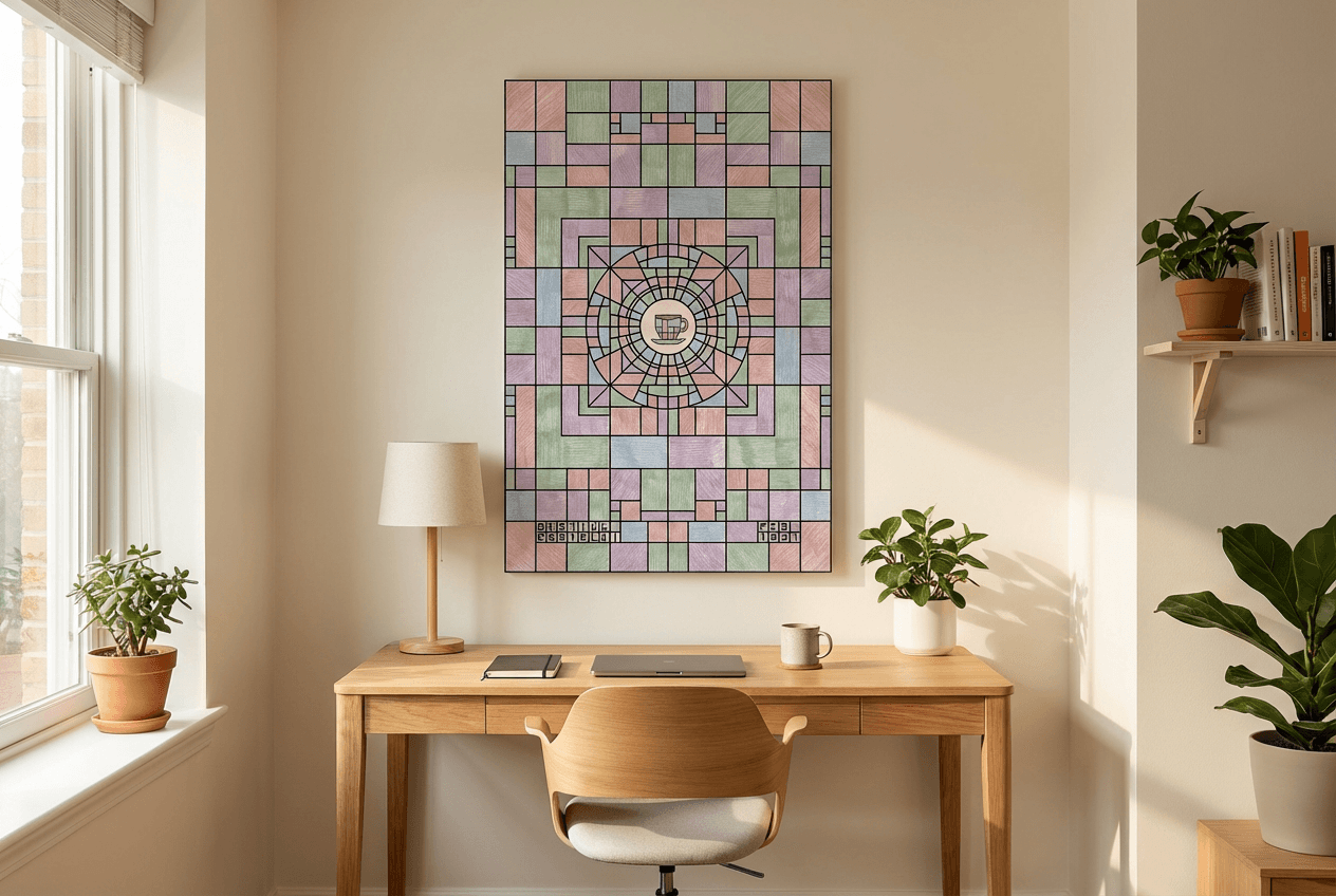
The desk in a studio deserves its own visual identity to foster concentration. Position above the workspace two or three medium-format posters (A3 or 30×45 cm) in an energizing but non-aggressive palette—muted yellows, mint greens, or minimalist graphic compositions. This micro-gallery creates a mental framework distinct from the relaxation space. If the desk is against a wall shared with the living area, an 80 cm wide decorative acoustic panel can serve as a soft transition, absorbing sound while visually marking the boundary between work and leisure. For more comprehensive strategies on creating a productive and aesthetically pleasing workspace, explore our 50 office decor ideas that can be adapted to even the smallest studio corners.
Organizing visually with panels or light partitions
Openwork screens or mid-height open shelving (120 cm) structure the space without blocking light. Treat these surfaces as walls in their own right: hang small posters on their side visible from the entrance, or arrange 30×40 cm canvases on the shelves, leaning against the wall. This stratification creates depth of field that visually enriches the studio while preserving its light permeability and sense of openness.
2026 trends: wall decor styles for studios
The year 2026 establishes three aesthetic currents perfectly suited to studio spatial constraints: luminous minimalism, natural bohemian, and bold chromatic accents. These trends share a common point: they favor targeted visual impact rather than accumulation, an ideal philosophy when every inch of wall counts.
Minimalism and clean lines
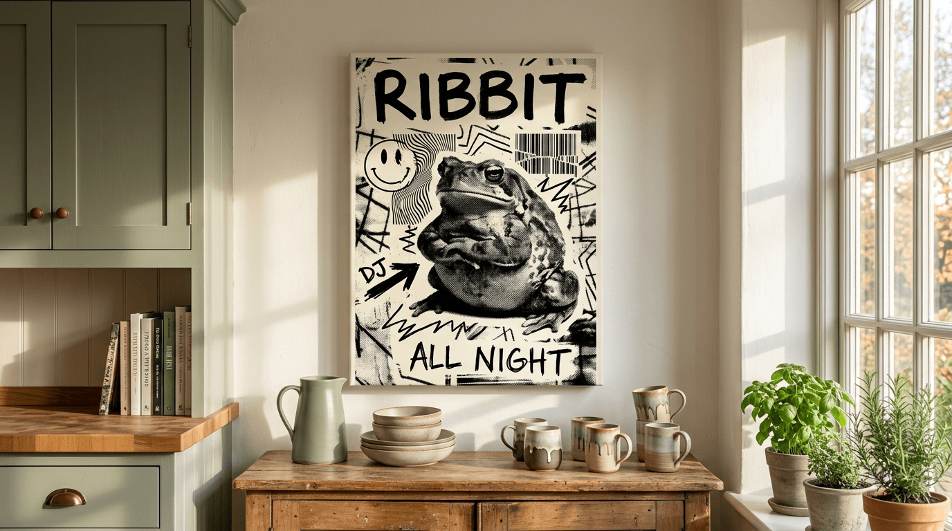
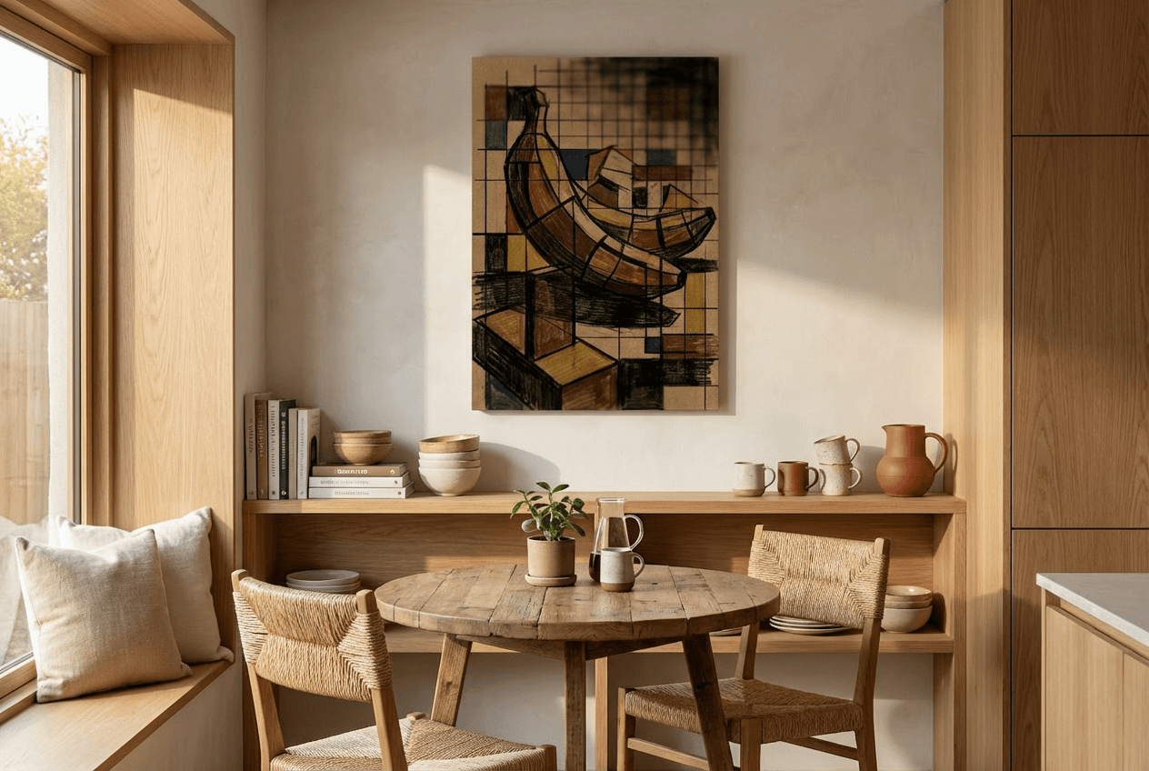
2026 minimalism abandons clinical coldness for warm sobriety: palettes of beiges, pearl grays, and off-whites punctuated by a single strong graphic element. A large black and white poster above the sofa is enough to visually structure the space without overloading it. Clean lines and simple geometric compositions create a calming effect particularly precious in a compact environment where the gaze cannot escape.
Bohemian and nature
Modern bohemian style marries natural textures and botanical patterns in earthy tones: terracotta, olive green, ochre. Nature prints representing tropical foliage or desert landscapes bring this organic connection without the maintenance of real plants. Pair them with natural fibers (macramé, rattan) to create a cocoon atmosphere that softens the angles of a rectangular studio.
Saturated colors and bold accents
At the opposite end of the spectrum, the maximalist trend embraces vibrant colors in controlled doses: a Klein blue accent wall, posters in saturated shades (mustard yellow, brick red) that energize the space. The studio trick? Limit boldness to a single wall or vertical composition of three posters maximum, letting the rest of the room breathe in neutral tones. This strategy creates an energizing focal point without visually shrinking the space—though if you're drawn to the glamorous sophistication of geometric patterns and jewel tones, consider exploring Art Deco interior design for a bolder approach.
Final checklist: transforming your studio in 5 steps
Step 1: Define your palette and style. Choose 2-3 dominant colors and a cohesive style (warm minimalism, natural bohemian, or controlled maximalism). This foundation will guide all your decorative choices and avoid the hodgepodge effect.
Step 2: Map your functional zones. Identify on paper where your sleeping corner, relaxation space, and work zone are located. Assign each zone a distinctive wall element—an accent color, a large poster, or a grouping of suspended objects.
Step 3: Install wall lighting. Before hanging your decorations, mount sconces and hidden LEDs. Stratified lighting instantly transforms space perception and highlights what you'll hang next.
Step 4: Compose your wall gallery. Arrange posters and canvases on the floor before drilling. Maintain 5-8 cm spacing, limit yourself to three formats maximum, and favor visuals that create depth—landscapes, airy abstractions, or clean botanicals.
Step 5: Add the 3D finishing touch. Complete with 2-3 relief elements: hanging plant, minimalist floating shelf, or textured acoustic panel. These three-dimensional accents break flatness without cluttering the floor.
Each step can be completed in one day. In one weekend, your studio gains structure, personality, and visual depth.
A well-decorated studio proves that restricted space never rhymes with aesthetic compromise. By playing with height, favoring artwork suited to the scale of your walls, and daring a few bold touches, you transform four white walls into a cocoon that reflects you. The essential lies in balance: each print, each canvas must have its reason for being, without overloading the eye. Take time to experiment with arrangements before drilling, let yourself be guided by your instinct, and don't hesitate to evolve your decor with the seasons. Your studio deserves as much character as a large apartment—you just need to know where to look.