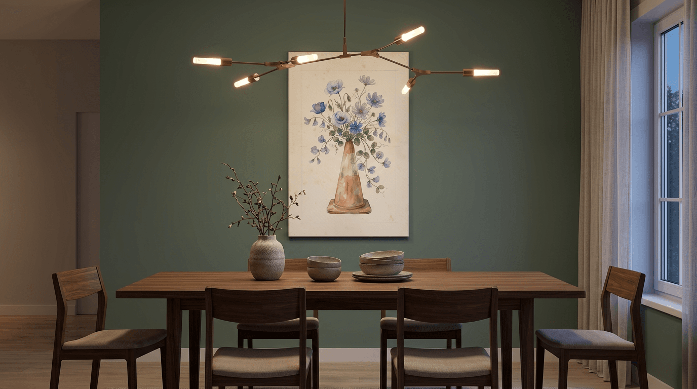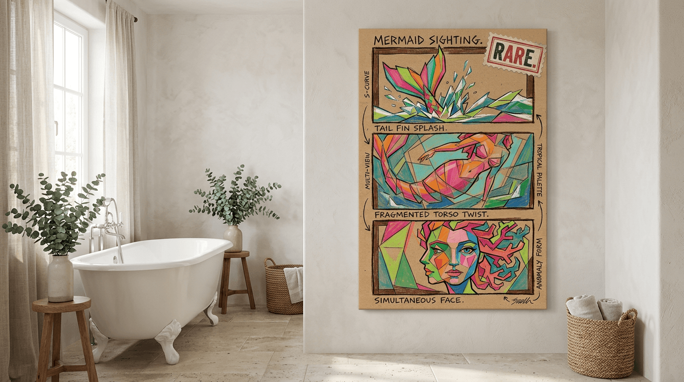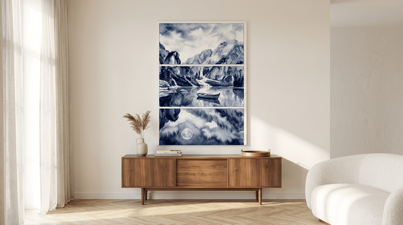
Kitchen wall decor ideas: Inspiring ways to transform your space in 2026
Transform your kitchen walls with 50+ inspiring decor ideas. From gallery walls and mirrors to functional shelves and vintage plates, discover renter-friendly solutions and layout strategies for every style.
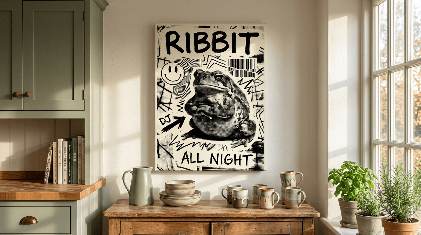
Your kitchen deserves more than builder-grade blank walls and a lonely calendar from 2019. Between the backsplash and upper cabinets, you've got prime real estate that can anchor the entire room's personality—whether you're drawn to moody minimalism, farmhouse warmth, or eclectic maximalism that makes guests linger over coffee.
The challenge isn't finding kitchen wall decor ideas; it's knowing which ones will survive steam, splatter, and the reality of vertical space squeezed between appliances. This guide walks you through battle-tested layouts, moisture-smart materials, and styling strategies that work for renters and owners alike—so you can transform those forgotten walls into a curated backdrop that feels intentional, not accidental.
Why Kitchen Wall Decor Matters: Creating a Space That Feels Like Home
Your kitchen is more than a place to cook—it's where morning coffee rituals happen, where friends gather during dinner parties, and where spontaneous conversations unfold over a glass of wine. Yet most kitchens remain stubbornly functional, their walls bare or cluttered with mismatched magnets and outdated calendars. The space between your cabinets and backsplash is prime real estate for establishing personality without sacrificing precious counter space.
Intentional kitchen wall decor transforms the room's emotional temperature. A carefully chosen piece of art—whether playful canvas prints for kitchen or serene botanical posters—signals that this isn't just a workspace but a curated environment worth lingering in. Unlike open shelving that demands constant tidying or decorative objects that collect grease splatter, wall art delivers visual impact while staying out of your cooking workflow.
The Practical Benefits Beyond Aesthetics
Well-chosen wall decor also solves spatial challenges. Vertical arrangements draw the eye upward in kitchens with low ceilings, while horizontal layouts can balance awkwardly wide walls flanking windows or doorways. In open-concept homes, kitchen art creates visual continuity with adjacent living spaces, ensuring your design story flows seamlessly rather than abruptly stopping at the refrigerator. The right pieces anchor your color palette, tie together disparate finishes, and give guests something compelling to look at while you're plating dessert—all without requiring a renovation budget or permanent installation.
Before You Decorate: 5 Key Considerations for Kitchen Walls
Even the most beautiful kitchen wall decor won't succeed if it's placed in the wrong spot or clashes with your existing layout. Before you commit to a gallery wall or start hanging art, take stock of your kitchen's unique conditions and constraints. Five minutes of planning now prevents months of regret later.
Heat, Steam & Splatter Zones: Where to Place Decor Safely
Your kitchen produces more moisture and temperature fluctuation than any other room in your home. The zone directly above your cooktop—typically within 90 cm of the burners—is hostile territory for paper prints. Steam condenses, grease particles settle, and heat can warp frames over time.
Safe zones include walls adjacent to your dining area, the space above a breakfast nook, or any wall perpendicular to your cooking surface. Canvas prints handle humidity better than paper, making them a smart choice for walls near sinks or dishwashers. If you're decorating a wall that occasionally catches splatter, choose canvas prints for kitchen that can be wiped clean with a damp cloth.
Lighting & Wall Condition: Assessing Your Canvas
Walk into your kitchen at different times of day and note where natural light falls. South-facing walls receive intense afternoon sun that can fade prints over time, while north-facing walls stay consistently dim and benefit from lighter, brighter artwork. Recessed lighting or pendant fixtures create hotspots—avoid hanging art directly in these beams.
Check your wall surface too. Textured plaster shows through thin paper, while glossy paint creates glare behind glass. Most modern kitchens have smooth, matte walls that work beautifully with both posters and canvas.
Renter vs. Owner: Damage-Free & Permanent Solutions
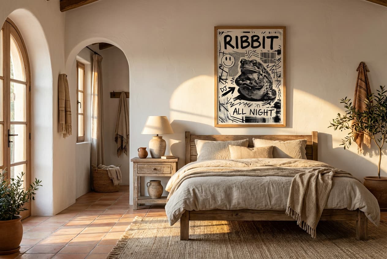
Homeowners can drill freely, but renters need strategies that preserve security deposits. Command strips rated for your artwork's weight work reliably on painted drywall. Picture-hanging strips hold up to 7 kg per set and remove cleanly. Tension rods between cabinets or adhesive rails offer gallery-style flexibility without holes.
Owners have the luxury of proper picture hooks and the option to paint accent walls that enhance their decor. Either way, plan your layout on the floor first—masking tape on the wall marks placement before you commit.
Kitchen Style & Color Palette: Finding Your Design Direction
Your kitchen's existing finishes guide your decor choices. White shaker cabinets welcome bold, colorful posters for kitchen, while dark wood cabinetry pairs beautifully with monochrome or metallic prints. Stainless steel appliances harmonize with cool-toned artwork, and brass hardware calls for warmer palettes.
Extract two or three colors already present in your backsplash, countertop, or textiles. Your wall art should echo at least one of these hues to feel intentional rather than arbitrary.
Scale & Proportion: Matching Decor to Your Wall Space
A single A3 print looks lost on a 2-meter wall, while an oversized canvas overwhelms a narrow breakfast nook. As a baseline, your largest piece should span roughly two-thirds of the furniture width below it, or 60–75% of an empty wall section. Vertical spaces—like the narrow wall beside a refrigerator—suit portrait-oriented prints or stacked arrangements. Wide expanses above counters call for landscape formats or multi-piece gallery walls that stretch horizontally.
Gallery Walls & Arrangement Layouts: The Foundation of Kitchen Wall Decor
Before you hang a single piece, understand this: the arrangement matters as much as the art itself. A thoughtfully composed gallery wall transforms scattered prints into a cohesive visual statement, while a haphazard layout makes even museum-quality pieces feel cluttered. The good news? You don't need a design degree—just a proven template and a few measurements. If you're looking for comprehensive guidance on creating stunning arrangements, our complete guide to gallery wall layouts walks you through dozens of proven configurations with step-by-step planning tools.
Grid Layouts: Clean, Modern, and Forgiving
Grid arrangements are the most forgiving option for beginners. Choose three to six prints in identical sizes (A3 or 40×60 cm work well), then hang them in perfect rows with equal spacing—typically 5–8 cm between frames. The symmetry creates instant visual calm, making grids ideal for minimalist or modern kitchens where you want art to complement rather than dominate.
The secret to flawless grids? Measure from the edges of your wall space, not the center. If you're filling the area above a breakfast nook, subtract your total frame widths and multiply your gaps by the number of spaces, then divide what's left to find your margins. This ensures the composition feels intentionally anchored rather than accidentally centered.
Salon-Style Arrangements: Eclectic & Personal
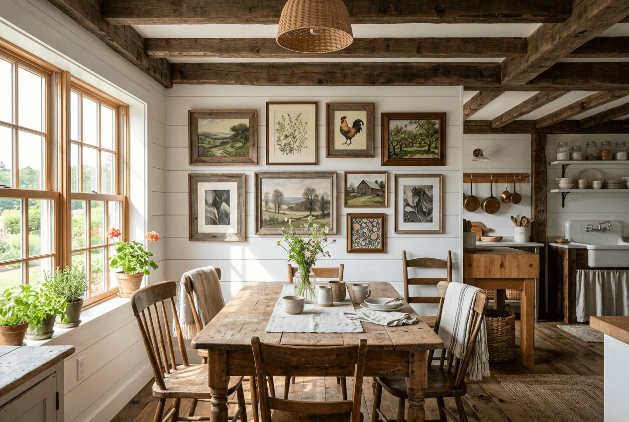
Salon walls—those artfully "messy" clusters you see in design magazines—follow hidden rules. Start with your largest piece at eye level (roughly 145–150 cm from the floor to the print's center), then build outward with smaller works. Maintain 5–10 cm spacing between all edges, and ensure the overall silhouette forms a rough geometric shape: oval, rectangle, or cloud.
For kitchens, salon walls work beautifully above dining areas or long blank stretches between windows and doorways. Mix sizes freely, but limit yourself to two or three frame colors maximum. A collection of posters for dining room in varied sizes creates the eclectic energy without visual chaos.
Linear & Floating Layouts: Minimalist Alternatives
Not every wall needs a cluster. Linear layouts—three to five prints hung in a single horizontal row—create elegant simplicity above counters or along narrow walls. Keep the bottom edges aligned and space them 8–12 cm apart. This works especially well when your prints share a theme but vary in content.
Floating layouts place a single oversized canvas (50×70 cm or larger) as a standalone statement piece. This approach suits small kitchens where a gallery wall would overwhelm, or when you want one bold focal point. Position it 15–20 cm above furniture or 150 cm from the floor if wall-mounted alone.
Pro Tips for Spacing, Alignment & Visual Balance
Always create a paper template before hammering. Trace your prints on kraft paper, tape the templates to the wall with painter's tape, then step back and adjust. This lets you experiment without leaving holes.
Maintain consistent spacing throughout your arrangement—mixing 5 cm gaps with 12 cm gaps reads as careless rather than intentional. Use a laser level or painter's tape grid to ensure alignment; even 2 cm of drift becomes obvious once the art is hung.
Finally, consider visual weight. A dark, high-contrast print "weighs" more than a pale watercolor of the same size, so balance bold pieces with lighter ones across your composition. This prevents one side from feeling heavier than the other, even when sizes are symmetrical.
Kitchen Wall Decor Ideas by Category
The beauty of kitchen wall decor lies in its versatility—you're not limited to traditional art. From functional storage solutions to nostalgic collectibles, every category offers unique opportunities to layer personality while solving practical challenges. Below, we've organized dozens of ideas into actionable categories so you can mix, match, and build a kitchen that feels authentically yours.
Art & Prints: Photography, Botanical, Typographic & Abstract
Wall art remains the most accessible and impactful starting point. Posters for kitchen spaces work brilliantly when you choose moisture-resistant substrates and themes that complement culinary environments—think botanical illustrations of herbs and vegetables, vintage food advertisements, abstract compositions in your accent colors, or typographic prints featuring recipe snippets or culinary quotes.
Photography prints bring sophistication: black-and-white market scenes, close-ups of coffee beans or citrus slices, or architectural shots of European cafés. Botanical prints—especially vintage scientific illustrations of edible plants—bridge the gap between art and function, subtly reinforcing your kitchen's purpose. Abstract and geometric prints add contemporary energy without competing for attention against busy countertops.
For maximum durability near sinks or windows, canvas prints for kitchen offer a wipeable surface that withstands occasional splashes while maintaining gallery-quality color depth. Arrange three to five prints in a linear row above a breakfast nook, or create a grid of six identical-sized botanicals for symmetrical impact.
Mirrors: Brightening & Expanding Your Space
Mirrors perform double duty in kitchens: they amplify natural light and create the illusion of more space—critical in galley or U-shaped layouts. Position a large round or arched mirror opposite a window to bounce daylight deeper into the room, or hang a narrow horizontal mirror above a peninsula to visually extend the countertop line.
Avoid placing mirrors directly behind cooktops where grease buildup becomes a maintenance headache. Instead, install them on perpendicular walls or in dining nooks where they'll reflect your gallery wall or pendant lighting. Vintage mirrors with ornate frames add farmhouse charm, while frameless or minimalist metal-edged mirrors suit contemporary aesthetics.
For rental-friendly options, lean an oversized floor mirror against an unused wall corner—it adds drama without requiring hardware, and you can reposition it as your layout evolves.
Decorative Plates & Ceramics: Functional Art That Pops
Plate walls have surged in popularity because they merge collectibility with visual impact. Hunt for vintage plates at flea markets—mismatched patterns in a cohesive color family create eclectic charm, while identical white plates with varied textures offer understated elegance. Hang them using adhesive plate hangers or display stands to avoid drilling multiple holes.
Ceramic tiles, hand-painted trivets, or decorative serving platters work equally well. Arrange them in a tight cluster for salon-style energy, or space them evenly in a grid for modern symmetry. The three-dimensional quality of ceramics adds depth that flat art can't replicate, casting subtle shadows that shift with changing light throughout the day.
Pair plate arrangements with one or two landscape prints on adjacent walls to balance the busy texture of ceramics with calming visual breathing room.
Vintage Signs & Neon: Adding Personality & Nostalgia
Enamel advertising signs—think retro soda brands, bakery logos, or coffee shop graphics—inject instant nostalgia. Their industrial aesthetic pairs beautifully with exposed brick, subway tile, or stainless steel appliances. Look for authentic vintage pieces or high-quality reproductions, and hang them solo as statement pieces or grouped asymmetrically for a collected-over-time feel.
LED neon signs offer a contemporary twist: custom phrases like "Bon Appétit" or simple icons (a coffee cup, a whisk) glow warmly without the heat or fragility of traditional neon. Mount them above open shelving or in a breakfast nook for ambient evening lighting that doubles as decor.
Balance the boldness of signage with quieter elements—a vintage Coca-Cola sign demands visual space, so avoid crowding it with competing focal points.
Floating Shelves & Ledges: Storage That Doubles as Display
Floating shelves blur the line between storage and decor. Style them with a curated mix: cookbooks leaning vertically, small potted herbs, a framed print or two, and functional items like olive oil bottles or ceramic canisters. The key is restraint—overstuffed shelves read as clutter, while thoughtfully spaced objects create intentional vignettes.
Picture ledges offer flexibility: lean multiple prints against the wall and swap them seasonally without re-hanging. This works especially well for renters or anyone who craves variety. Arrange ledges in a staggered vertical stack for dynamic visual rhythm, or install a single long ledge above upper cabinets to display oversized serving platters and art simultaneously.
Choose materials that match your kitchen's finishes—reclaimed wood for farmhouse warmth, sleek white lacquer for minimalism, or black metal brackets for industrial edge.
Pegboards & Rails: Organizing While Decorating
Pegboards have evolved beyond garage storage into stylish kitchen solutions. Paint one in a bold accent color, mount it on an empty wall, and use it to hang utensils, small plants, cutting boards, and even lightweight framed prints. The grid structure creates visual order while keeping frequently used tools within arm's reach.
Rail systems with S-hooks offer similar functionality with a sleeker profile. Install a brass or matte black rail beneath upper cabinets to suspend mugs, ladles, or small baskets—the vertical lines draw the eye upward, making ceilings feel taller.
Both options work beautifully in open-concept kitchens where the "back of house" is always on display, turning practical storage into an intentional design feature.
Woven Baskets & Textiles: Warmth & Texture
Flat baskets—especially vintage or handwoven varieties—add organic texture that softens hard kitchen surfaces. Hang three to five in varying sizes on a blank wall for bohemian warmth, or arrange them symmetrically for a more tailored look. Their neutral tones complement nearly any color palette while introducing tactile depth.
Textile wall hangings, macramé pieces, or even framed fabric swatches bring softness rarely found in kitchens. Choose washable materials and avoid placing them near steam-heavy zones. A single large woven piece above a dining bench creates a cozy focal point without the permanence of paint or wallpaper.
Layer baskets with canvas or poster art on adjacent walls—the mix of textures prevents the space from feeling one-dimensional.
Family Photos & Personal Memories: Making It Yours
Kitchens are gathering spaces, making them ideal for personal photography. Create a timeline wall of family milestones, a travel photo collection from favorite culinary destinations, or candid shots from holiday meals. Black-and-white photos in matching frames offer timeless elegance, while color snapshots in mismatched frames feel casual and lived-in.
Use ledges or clipboards with twine to rotate photos seasonally—kids' artwork, vacation snapshots, or seasonal celebrations—keeping the space dynamic and emotionally resonant. Position personal photos where guests naturally gather: near the breakfast table, above a coffee station, or along a hallway leading into the kitchen. If you're creating a dedicated family photo display, the principles for arranging kids' artwork and family memories translate beautifully to kitchen spaces.
Balance intimate family moments with broader design elements so the space doesn't feel like a scrapbook—pair a photo cluster with abstract art or botanical prints for visual variety.
Cookbooks & Culinary Objects: Celebrating Your Passion
If cooking is your passion, celebrate it. Mount a narrow shelf to display vintage cookbooks with beautiful spines, or prop a cherished recipe box alongside framed menu cards from memorable restaurants. Antique kitchen tools—copper molds, wooden rolling pins, cast-iron trivets—become sculptural when hung intentionally rather than stored away.
Group culinary objects by theme: all copper pieces together, a collection of French cafe posters, or a grid of vintage spice tins. The repetition creates cohesion, transforming random items into a curated collection.
Avoid functional items you use daily—grease and flour dust will require constant cleaning. Reserve wall displays for decorative or sentimental pieces that can stay untouched between deep cleans.
Kitchen Wall Decor Ideas by Style: Modern, Farmhouse, Minimalist & More
Your kitchen's existing design language should guide every wall decor decision. The right artwork amplifies your style rather than fighting it—whether you're working with sleek contemporary cabinetry, reclaimed wood accents, or the clean lines of Scandinavian design. Here's how to choose kitchen wall decor that feels intentional and cohesive across five popular styles.
Modern & Contemporary: Clean Lines & Bold Statements
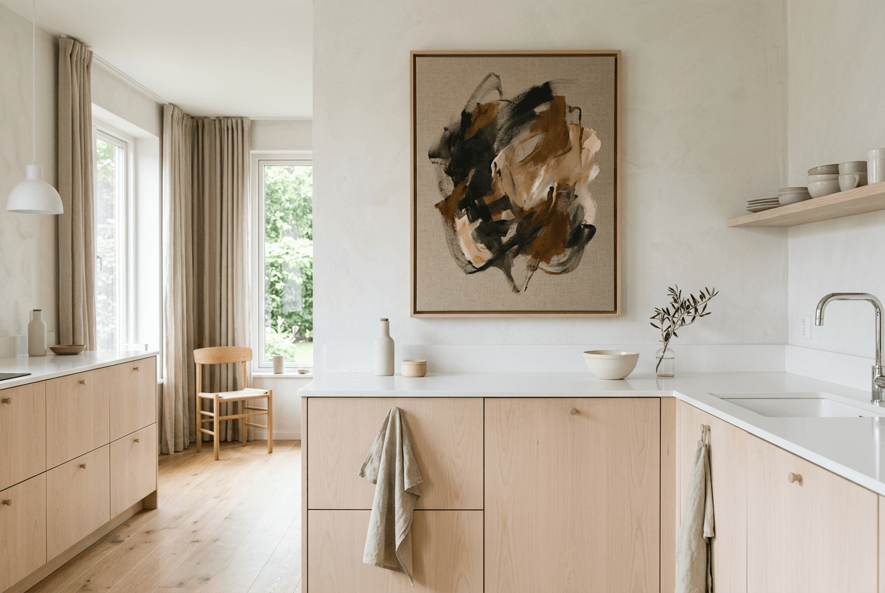
Modern kitchens thrive on contrast and visual impact. Choose large-format canvas prints with geometric abstracts, monochromatic photography, or bold typography that command attention without cluttering sightlines. A single oversized piece (50×70 cm or larger) works better than multiple small prints—it respects the architectural simplicity while adding personality.
Stick to a palette of two to three colors maximum, echoing your countertops or backsplash. Black-and-white compositions offer timeless sophistication, while a single accent color (burnt orange, deep teal, or mustard yellow) creates a focal point. Canvas prints suit modern kitchens particularly well—their frameless edges maintain the streamlined aesthetic that defines contemporary design.
Farmhouse & Rustic: Vintage Warmth & Natural Materials
Farmhouse kitchens celebrate imperfection and lived-in charm. Layer botanical prints, vintage-inspired typography, and pastoral landscapes in mismatched arrangements that feel collected over time. Think weathered wood tones, cream backgrounds, and illustrations of herbs, vegetables, or farm animals that nod to the style's agrarian roots.
A salon-style arrangement works beautifully here—mix print sizes and subjects with 5–8 cm spacing for an artfully curated look. Pair escape into breathtaking landscapes with typographic kitchen quotes and botanical studies to build visual interest. The key is intentional imperfection: symmetry feels too formal for farmhouse style, so embrace organic layouts that mirror the style's relaxed, welcoming energy.
Minimalist & Scandinavian: Less Is More
Minimalist kitchens demand restraint. One or two carefully chosen pieces outperform a crowded wall every time. Opt for line drawings, abstract watercolors in muted tones, or simple botanical studies with generous white space. The artwork should whisper rather than shout—think soft grays, warm beiges, and pale blues that complement Nordic-inspired palettes.
Position a single large canvas or a pair of identical posters in perfect symmetry. Grid layouts with equal spacing (5 cm between prints) maintain the visual order that defines this style. Avoid busy patterns, bright colors, or ornate subjects—simplicity is the ultimate sophistication in Scandinavian design, and your wall decor should honor that philosophy.
Eclectic & Bohemian: Curated Collections & Color
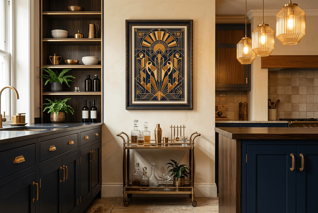
Eclectic kitchens are permission to break rules. Mix art deco posters with abstract expressionism, vintage advertisements, and colorful botanicals in layered, asymmetrical arrangements. The unifying thread isn't style—it's intentionality. Each piece should feel chosen, not random.
Embrace color fearlessly. Layer jewel tones (emerald, sapphire, ruby) with earthy terracottas and warm ochres. Vary print sizes dramatically—pair a large 50×70 cm centerpiece with smaller 30×45 cm satellites. The salon-style layout is your friend here, building outward from a central anchor piece and filling negative space organically. Just maintain consistent spacing (8–10 cm) to prevent chaos from tipping into clutter.
Industrial & Transitional: Metal, Wood & Mixed Media
Industrial kitchens balance raw materials with refined finishes. Choose artwork with urban landscapes, architectural photography, or abstract compositions in blacks, grays, and metallic accents. Typography prints with vintage industrial motifs (blueprints, factory signage, transportation themes) reinforce the aesthetic without overwhelming exposed brick or metal fixtures.
Transitional kitchens—blending traditional warmth with contemporary simplicity—benefit from neutral-toned abstracts or landscapes that bridge both worlds. Stick to linear or grid arrangements for visual order, and opt for canvas prints whose texture adds subtle dimension without introducing ornate frames that would conflict with the style's understated sophistication.
Bring Your Kitchen Wall Ideas to Life: Posters, Canvas & Wall Art
Once you've settled on a style and arrangement, the next decision is substrate. The format you choose—canvas, poster, metal, or wood—affects not only aesthetics but also durability, maintenance, and how easily you can refresh your kitchen's look. Kitchens demand materials that can withstand humidity, occasional splatter, and temperature fluctuations, making some formats more practical than others.
Canvas Prints: Durability & Impact for Kitchen Environments
Canvas prints excel in kitchens. The stretched textile surface resists moisture better than paper, and the frameless, gallery-wrapped edges deliver a modern, finished look without additional hardware. A large canvas above a breakfast nook or opposite the sink creates instant impact, anchoring the room with texture and depth. Because canvas doesn't require glass, there's no glare to compete with task lighting, and the matte finish softens reflections. Wipeable with a damp cloth, canvas prints for kitchen handle the occasional steam or grease mist that inevitably drifts beyond the cooktop zone.
Framed Posters: Versatility, Affordability & Easy Swaps
Posters offer unmatched flexibility. Printed on high-quality paper and paired with a simple frame, they allow you to rotate artwork seasonally or as your taste evolves—without the commitment of a permanent installation. A set of three botanical posters in slim black frames can transform a narrow wall in minutes, and swapping one out for a new print costs a fraction of redecorating. For renters or anyone who enjoys frequent updates, posters deliver editorial-grade imagery at accessible price points. Choose frames with acrylic glazing rather than glass to reduce weight and breakage risk.
Metal & Wood Art: Texture & Longevity
Metal and wood prints introduce tactile contrast. Metal's high-gloss surface amplifies color saturation and works well in industrial or ultra-modern kitchens, while wood grain adds organic warmth to farmhouse and rustic spaces. Both substrates are exceptionally durable and easy to clean, though they tend to be heavier and pricier than canvas or paper. Reserve these for permanent statement pieces rather than experimental layouts.
Choosing Frames That Complement Your Decor
Frame selection quietly reinforces your kitchen's style. Slim black or white frames suit minimalist and Scandinavian interiors, while natural oak or walnut frames enhance farmhouse and mid-century aesthetics. For eclectic galleries, mix frame colors and profiles deliberately—alternating matte black with brass or whitewashed wood—to create visual rhythm without chaos. Ensure frame depth accommodates the mat if you're using one; a 2–3 cm mat prevents the print from touching the glazing, adding a polished, gallery-quality finish.
Renter-Friendly Kitchen Wall Decor: No Nails, No Damage, No Regrets
Renting doesn't mean sacrificing style. Modern adhesive technology and creative display methods let you transform bare kitchen walls without forfeiting your security deposit. The key is choosing solutions designed for temporary installation—tools that hold securely through daily cooking but remove cleanly when you move. These approaches work equally well for homeowners testing layouts before committing to permanent holes. Many of these damage-free techniques also work brilliantly in compact studio spaces where flexibility and non-permanent solutions are essential.
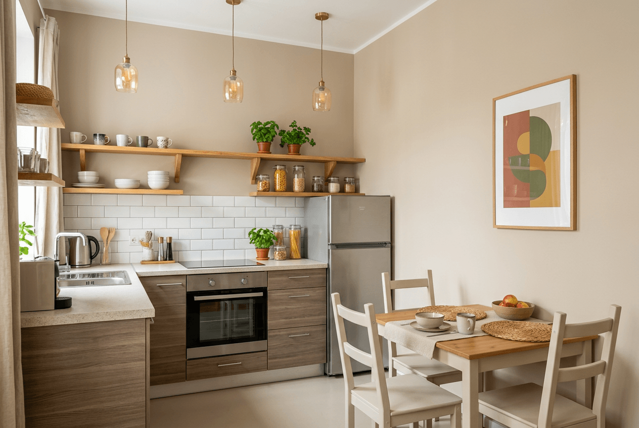
Damage-Free Adhesive Strips & Removable Frames
Command strips and similar adhesive systems support surprisingly heavy loads when applied correctly. Clean the wall with rubbing alcohol, let it dry completely, then press strips firmly for 30 seconds. Most brands hold 2-4 kg per strip pair—enough for A2 posters or small canvas prints. For kitchen environments, check packaging for moisture-resistant formulations. Remove by pulling the tab straight down, not outward, to avoid paint damage.
Leaning & Propping: The No-Commitment Approach
The simplest renter solution requires zero wall contact. Lean oversized canvas against the backsplash on open counter sections, or prop prints on top of upper cabinets where soffits meet the ceiling. This works best with larger formats (50×70 cm or bigger) that stay stable without support. Position pieces away from active cooking zones—a propped canvas beside the refrigerator or on a breakfast bar adds visual weight without interfering with meal prep.
Removable Wallpaper & Peel-and-Stick Accents
Peel-and-stick wallpaper offers pattern and color for renters willing to invest slightly more effort. Apply to the wall section between upper and lower cabinets to create an accent zone, then layer smaller prints over the pattern for dimensional interest. Choose vinyl-coated options for moisture resistance. Test a small corner section first—some formulations adhere too aggressively to textured drywall.
Temporary Shelving & Ledge Solutions
Picture ledges mounted with damage-free strips create flexible display surfaces. Arrange 2-3 small prints in overlapping layers, rotating seasonally without new holes. Freestanding easels work for single statement pieces on countertops or open shelving. Both approaches let you adjust compositions daily—useful when you're still discovering your kitchen's aesthetic rhythm.
Common Kitchen Wall Decor Mistakes to Avoid
Even the best intentions can fall flat when common pitfalls undermine your kitchen wall decor. Recognizing these mistakes before you hang your first piece saves time, money, and aesthetic regret.
Overcrowding & Visual Chaos
The most frequent error is cramming too many pieces onto available wall space. A gallery wall should breathe—aim for 5–8 cm spacing between prints in grid layouts, and resist the urge to fill every centimeter. Three well-chosen pieces often deliver more impact than a dozen competing for attention. If your kitchen feels visually noisy after installation, remove the smallest or least cohesive items and reassess.
Ignoring Lighting & Wall Condition
Hanging art on a poorly lit wall wastes its potential, while uneven or textured surfaces cause canvases to tilt or frames to sit crooked. Test lighting at different times of day before committing to placement, and use adjustable picture hooks or adhesive strips with built-in levelers on imperfect walls. Matte-finish canvas naturally minimizes glare from overhead task lighting better than glass-fronted frames.
Mismatched Frames & Inconsistent Styling
Eclectic doesn't mean haphazard. Mixing five different frame styles, three wood tones, and random mat widths creates visual confusion rather than curated charm. Choose a unifying element—identical frames in varied sizes, a consistent color palette across different subjects, or frameless canvas throughout. Even bohemian kitchens benefit from intentional cohesion.
Placing Decor in High-Moisture Zones
Paper prints positioned within 90 cm of sinks or stovetops will warp, fade, or collect grease within months. Reserve these vulnerable zones for wipeable canvas prints for kitchen or leave them bare. If you must decorate near moisture sources, ensure adequate ventilation and commit to regular cleaning.
Forgetting Function & Practicality
Beautiful wall decor shouldn't interfere with daily kitchen tasks. Avoid hanging pieces where cabinet doors swing open, where you reach for frequently used items, or at head-bumping height near work zones. Measure clearances before installing, and prioritize walls opposite work surfaces where art enhances the view without disrupting workflow.
Start Your Kitchen Wall Transformation Today
You've explored layout strategies, style-specific palettes, moisture-resistant materials, and renter-friendly installation methods. Now it's time to move from inspiration to action. The most successful kitchen transformations begin with three simple steps: measure your available wall space (including clearances around cabinets and appliances), identify one focal wall or zone to anchor your design, and choose 2-3 pieces that reflect your aesthetic rather than filling every surface at once.
Your Next Steps
Start by browsing posters for kitchen or canvas prints for kitchen to find artwork that speaks to your style—whether that's botanical prints for a farmhouse vibe, bold abstracts for modern minimalism, or vintage typography for eclectic charm. Remember that kitchen wall decor isn't permanent; you can rotate pieces seasonally, swap prints as your taste evolves, and experiment with arrangements using painter's tape templates before committing to hardware.
Your kitchen walls are waiting. Transform them into a space that welcomes you every morning and makes every meal feel intentional.