Gallery wall ideas: Inspiring layouts & step-by-step planning guide for 2026
Explore 50+ gallery wall ideas organized by layout style, room, and aesthetic. Get step-by-step planning guidance, layout templates, and expert tips to create a gallery wall that feels intentional and collected.
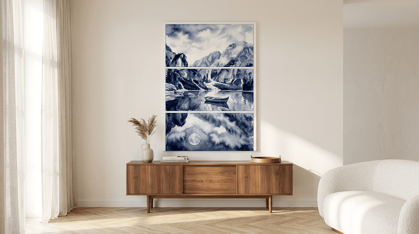
A blank wall doesn't need to stay blank—it needs a plan. The difference between a gallery wall that feels intentional and one that looks haphazard often comes down to a single afternoon of preparation, not an expensive designer or years of collecting art.
In this guide, you'll find gallery wall ideas that work in real homes, plus the exact step-by-step process to execute them without guesswork, nail holes in the wrong place, or that nagging feeling that something's slightly off. We'll walk through layout strategies for every room and aesthetic, the paper template method that eliminates measuring anxiety, and how to choose between posters and canvas to create visual rhythm and depth. Whether you're working with a narrow hallway, a vaulted living room, or a cozy bedroom corner, you'll leave with a clear plan—and the confidence to hang it yourself.
What Makes a Gallery Wall Work: The Core Principles
A gallery wall isn't just a collection of prints hung next to each other—it's a composed visual story. The difference between a wall that feels intentional and one that looks haphazard comes down to three foundational principles: purposeful selection, spatial harmony, and a thoughtful approach to cohesion. Master these, and you'll create a display that feels curated rather than cluttered, even if you're working with a mix of styles or sizes.
Intentionality Over Accumulation
The most common mistake is treating a gallery wall as a dumping ground for every piece of art you own. Successful walls begin with a clear vision—whether that's a colour palette, a theme, or an emotional tone. Before you hammer a single nail, ask yourself: what feeling do I want this wall to evoke? A serene escape might call for breathtaking landscape prints, while a playful hallway could lean into bold graphics or unexpected subjects. Edit ruthlessly. If a piece doesn't serve the overall composition, save it for another wall.
The Role of Spacing and Balance
Spacing is the invisible architecture of your gallery wall. Too tight, and the eye has nowhere to rest; too loose, and the arrangement feels disconnected. A consistent gap of 5–8 cm between pieces creates rhythm without rigidity. Balance doesn't mean symmetry—it means visual weight is distributed evenly. A large canvas 24×36 in on one side can be counterbalanced by a cluster of smaller posters on the other. Step back frequently as you plan. Your wall should feel anchored, not lopsided.
Frame Consistency vs. Eclectic Mix
There's no single "right" answer here—it depends on your aesthetic goal. Matching frames (same colour, same profile) create a gallery-like polish and let the artwork take centre stage. An eclectic mix of frames adds personality and works beautifully in bohemian or vintage-inspired spaces, but it requires more careful curation to avoid chaos. A middle path: vary frame styles but stick to a unified colour family (all black, all wood tones, all white). The key is coherence, not uniformity.
Gallery Wall Layout Styles: Which One Fits Your Space?
The layout you choose determines whether your gallery wall feels calm and composed or energetic and unexpected. Each style carries its own visual rhythm—and works best in specific spaces. Below are five proven layouts, each with clear guidance on where and how to use them.
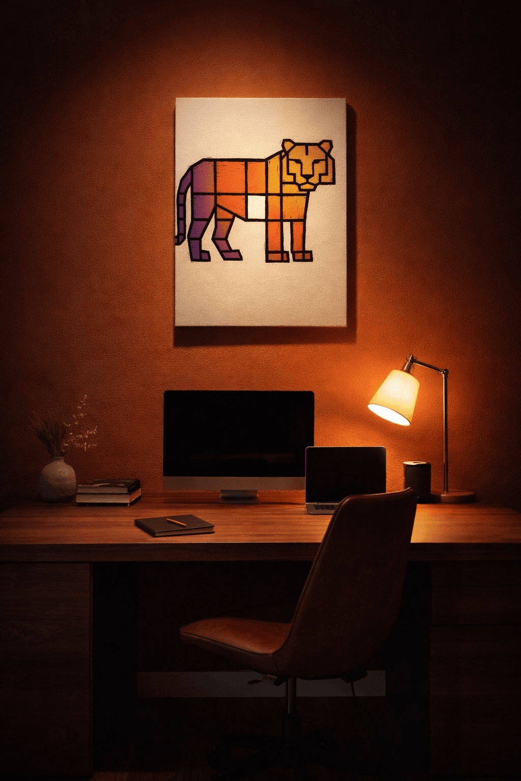
Grid Layout: Structured and Modern
A grid arranges prints in uniform rows and columns with equal spacing between each piece. This creates a clean, architectural feel that works beautifully in modern interiors, home offices, and dining rooms. The key is consistency: same-size frames, identical spacing (typically 5 cm), and aligned edges.
Grid layouts shine when you're working with a series—think botanical studies, abstract geometrics, or a collection of breathtaking landscape prints in matching sizes. The repetition creates visual calm, making this layout ideal for spaces where you want art to complement rather than dominate. Use A3 or 40×60 cm prints for a classic 3×3 grid, or scale up to 50×70 cm for a bolder 2×2 arrangement.
Salon Style: Curated and Eclectic
Salon-style walls pack multiple prints edge-to-edge with minimal spacing, creating a dense, layered effect that feels collected over time. This approach originated in 19th-century Parisian salons and remains the go-to for maximalist interiors, libraries, and eclectic living rooms.
The trick is controlled chaos: vary sizes dramatically (mix A2 with 30×45 cm pieces), but maintain a unifying thread—whether that's a shared color palette, subject matter, or frame finish. Start with your largest piece slightly off-center, then build outward. Salon walls work best on large, uninterrupted surfaces where the density becomes a statement. They're forgiving, too—you can add pieces over time without disrupting the composition.
Linear/Row Layout: Minimalist and Contemporary
A single horizontal row of prints creates a streamlined, gallery-like effect perfect for narrow walls, hallways, and spaces above furniture. This layout emphasizes negative space and works best with 3-5 prints in similar or identical sizes, hung at consistent eye level (typically 145-150 cm to center).
Linear arrangements suit minimalist and Scandinavian interiors where restraint is key. Use this layout above a sofa, console table, or bed—the horizontal line anchors the furniture below. For visual interest, vary the content while keeping sizes uniform, or introduce one slightly larger canvas print as an anchor piece flanked by smaller posters.
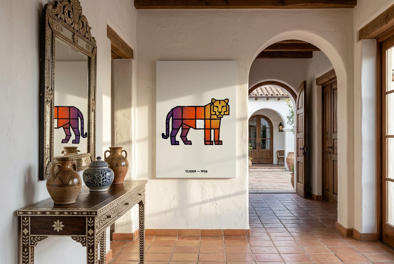
Asymmetrical Layout: Artistic and Dynamic
Asymmetrical layouts balance visual weight without mirroring—think of it as organized spontaneity. Pieces vary in size and placement, but the overall composition feels intentional. This style suits creative spaces, bedrooms, and contemporary living rooms where you want movement and personality.
The secret is visual anchoring: place your largest piece first (often off-center or lower-third), then arrange smaller prints around it, balancing negative space. Step back frequently—asymmetry requires more trial and error than grids. This layout works beautifully with mixed substrates: combine canvas prints with paper posters to add textural depth.
Staircase Gallery: Vertical Drama
Staircase walls follow the diagonal line of the stairs, creating a rising visual narrative. This layout transforms an often-overlooked transition space into a focal point. The key is maintaining a consistent baseline—either align the bottom edges of each frame with the stair angle, or keep centers at a fixed distance from the handrail (typically 15-20 cm).
Use this layout to tell a story: arrange prints chronologically, by color gradient, or thematically. Vary sizes slightly to avoid monotony, but keep spacing uniform. Staircase galleries work best with 5-9 pieces, depending on your stair length. This is an ideal spot for smaller landscape prints that might feel lost on larger walls.
How to Plan Your Gallery Wall: Step-by-Step Process
The difference between a gallery wall that looks intentional and one that feels haphazard comes down to planning. Most people skip this phase and go straight to hammering nails—then spend hours repositioning frames and patching holes. The five-step process below eliminates guesswork and gives you a foolproof roadmap from blank wall to finished display.
Step 1: Measure Your Wall and Define Your Space
Start by measuring the total width and height of your available wall space. Use painter's tape to mark the outer boundaries of your gallery wall directly on the wall—this creates a visual frame and prevents you from drifting too high, too low, or too wide as you plan. For walls above furniture, leave 15–20 cm of clearance above the sofa or console; for standalone walls, position the center of your arrangement at eye level (roughly 145–150 cm from the floor). Photograph your taped outline from multiple angles so you can reference the proportions as you select artwork.
Step 2: Choose Your Color Palette and Frame Style
Decide whether you're working with a monochrome scheme, a two-color palette, or a full-spectrum approach. This decision should flow naturally from your existing room colors and the mood you want to create. If your space is neutral, a gallery wall with bold, saturated prints can serve as the room's focal point. If your walls are already colorful, consider black-and-white or muted tones to avoid visual overload. Frame style follows the same logic: uniform black or white frames create cohesion in eclectic arrangements, while varied frames work best when the artwork itself shares a common thread (subject matter, color temperature, or medium). For canvas prints, the frameless edge becomes part of your design language—mix canvas and paper prints intentionally, not randomly.
Step 3: Gather and Arrange Your Art (The Paper Template Method)
Cut paper templates in the exact dimensions of each poster or canvas you plan to hang. Label each template with the artwork name and mark the hanging point (measure from the top edge of the frame to where the nail will sit). Tape the templates to your wall within the boundaries you defined in Step 1, experimenting with different arrangements until you find a layout that feels balanced. This is where you test asymmetry, adjust spacing, and swap pieces without committing to nail holes. Step back every few minutes—what looks centered up close often skews left or right from across the room. The paper method is especially valuable for salon-style walls where you're layering multiple sizes; you can move templates around for an hour until the composition clicks.
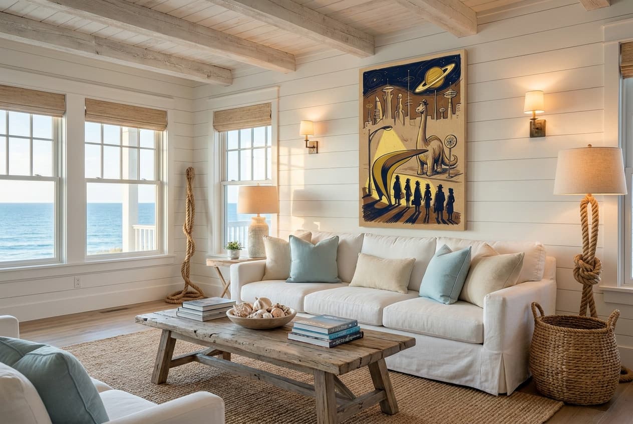
Step 4: Determine Spacing and Alignment
Measure the distance between each template and verify that your spacing is consistent—5 to 8 cm between pieces is the standard that keeps a gallery wall feeling curated rather than cramped. For grid layouts, use a level to confirm that all horizontal and vertical lines are true; even a 2-degree tilt becomes glaringly obvious when repeated across six frames. For asymmetrical arrangements, alignment matters less than visual weight distribution: if you have a large canvas on the left, balance it with a cluster of smaller posters on the right rather than trying to mirror it exactly. Mark light pencil dots at the corners of each template so you can remove the paper and still see your layout.
Step 5: Mark Your Nail Holes Before Hanging
Transfer the hanging point from each paper template to the wall by measuring down from the top edge of the template and marking a small X where the nail should go. Remove all templates, double-check your marks with a level, then install your hanging hardware (nails, picture hooks, or adhesive strips depending on weight). Hang your heaviest pieces first—these anchor the composition and make it easier to position lighter works around them. If a piece looks slightly off once hung, adjust it before moving to the next; small tweaks are easier to make incrementally than after the entire wall is up.
Gallery Wall Ideas by Room and Aesthetic
The beauty of a gallery wall lies in its adaptability—it can anchor a living room, energize an entryway, or transform a forgotten staircase into a narrative journey. But the right approach depends entirely on where you're hanging it and the mood you want to create. A salon-style arrangement that feels electric in a maximalist bedroom might overwhelm a minimalist hallway. A grid that brings order to a home office could feel sterile above a cozy sofa. This section breaks down room-specific and aesthetic-specific strategies, so you can match your gallery wall to both your space and your sensibility.
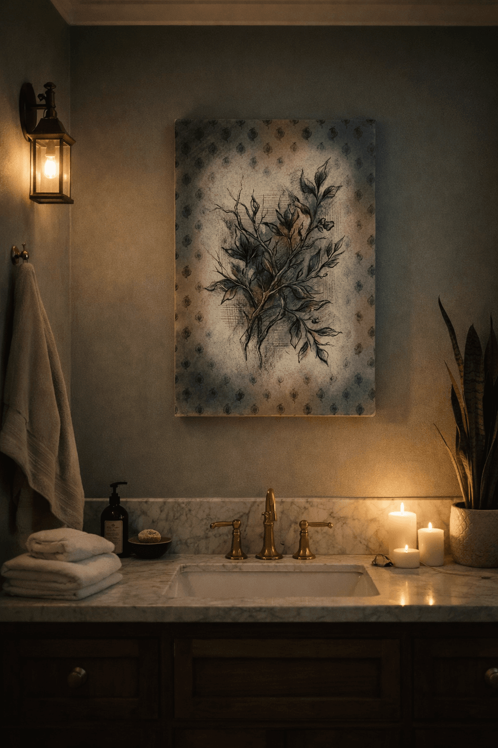
Living Room: Statement Walls Above Sofas
The living room is gallery wall territory—particularly the expanse above the sofa, which often sits empty or anchored by a single oversized piece. A well-executed gallery wall here becomes the room's visual anchor, drawing the eye and setting the tone for the entire space. Aim for a width that spans two-thirds to three-quarters of the sofa length, and position the arrangement so the center sits at eye level when you're seated (typically 140-145 cm from the floor). Asymmetrical layouts work beautifully here, allowing you to balance a large central canvas with smaller posters radiating outward. Choose pieces that echo your color palette—muted landscapes for calm, bold abstracts for energy—and leave 15-20 cm clearance between the sofa back and the lowest frame to avoid a cramped feel.
Bedroom: Intimate and Personal Displays
Bedrooms invite introspection, so gallery walls here should feel personal rather than performative. This is the place for linear arrangements above the headboard—three to five pieces in a single row, each framed identically to maintain serenity. Keep the palette soft: monochrome photography, watercolor botanicals, or abstract line art in muted tones. The goal is visual interest without overstimulation; you want something beautiful to wake up to, not a wall that demands attention. If you're working with a smaller bedroom, a tightly curated grid of four or six pieces (all the same size) creates impact without overwhelming the space. Position the arrangement so the bottom edge sits 20-25 cm above the headboard. For more inspiration on creating a restful atmosphere in compact sleeping quarters, explore our guide to studio wall decor where space-conscious design principles apply beautifully to bedroom galleries.
Entryway: First-Impression Galleries
An entryway gallery wall is your home's opening statement—it sets expectations before a guest steps into the main living area. This is where salon-style arrangements shine: a dense, slightly chaotic mix of sizes and orientations that feels collected and intentional. Because entryways are often narrow, vertical arrangements work better than horizontal sprawls. Start with a large anchor piece at eye level (145-150 cm to its center), then build outward and upward, filling the wall without leaving large gaps. Choose pieces with visual punch—high contrast, bold color, or strong graphic elements—that register immediately. If your entryway leads to a staircase, consider extending the gallery up the stairwell for continuity.
Staircase: Vertical Storytelling
Staircases offer a unique opportunity: a vertical canvas that unfolds as you ascend. The key is to align the arrangement with the angle of the stairs, creating a diagonal flow that mirrors the handrail. Position each piece so the center sits at consistent eye level as you climb—typically 145-150 cm from each step's tread. This creates a rhythm that feels natural rather than static. Linear arrangements work well here (a single row of identically sized pieces), as do asymmetrical clusters that step upward in size. Avoid overly dense salon layouts on staircases; the movement through the space already provides visual interest, so your gallery wall should complement rather than compete.
Home Office: Motivational and Functional Walls
A home office gallery wall should balance inspiration with focus—you want visual interest during Zoom calls, but not distraction during deep work. Grid layouts are ideal here: the structure reinforces productivity, and uniform sizing keeps the wall from fragmenting your attention. Choose pieces that motivate without overwhelming: architectural photography, minimalist abstracts, or typographic prints with short, meaningful phrases. Position the gallery behind your desk (visible on video calls) or on the wall you face while working. Keep the palette cohesive—no more than three colors—and ensure the arrangement doesn't extend into your peripheral vision if it's beside your monitor. For comprehensive strategies on curating a workspace that enhances both productivity and aesthetics, our office decor ideas article offers detailed guidance on balancing function with visual appeal.
Minimalist Aesthetic: Clean Lines and Breathing Room
Minimalist gallery walls are exercises in restraint. Choose three to five pieces maximum, each with ample breathing room (10-15 cm spacing or more). Linear arrangements work beautifully—a single row of three identically sized posters, centered and spaced evenly. Stick to a monochrome or near-monochrome palette: black and white photography, charcoal sketches, or soft sepia tones. Frames should be identical and simple—thin black or natural wood, no ornate detailing. The goal is to create a focal point that feels intentional and curated, not sparse or unfinished. If you're working with canvas, choose pieces with subtle texture rather than bold color to maintain the minimalist ethos.
Maximalist Aesthetic: Bold Colors and Layered Textures
Maximalism is about abundance without chaos—more is more, but it still needs structure. Salon-style arrangements are your friend here: dense, varied, and visually rich. Mix large canvas pieces with smaller posters, vary orientations (portrait and landscape), and embrace bold color. The trick is to find a unifying thread—perhaps a recurring accent color, a shared subject (all florals, all abstracts), or a consistent frame finish. Don't be afraid of visual weight: a maximalist gallery wall should feel full, even slightly overwhelming, but never random. Leave minimal spacing (5-6 cm) to create density, and extend the arrangement edge-to-edge across the wall for maximum impact.
Vintage and Eclectic: Collected-Over-Time Feel
Vintage and eclectic gallery walls should look like they've evolved organically, even if you're planning them from scratch. The secret is intentional imperfection: vary frame styles (mix wood tones and finishes), include different matting widths, and embrace slight asymmetry in your layout. Choose artwork that feels timeless—botanical prints, vintage maps, black-and-white portraiture, or abstract pieces with a weathered quality. Asymmetrical layouts work best, as they mimic the way a collection naturally grows. The goal is to create a wall that feels discovered rather than designed, as if each piece has a story and arrived at a different moment. If you're designing a gallery wall for a child's space that will evolve as they grow, consider the principles in our kids room wall decor guide for creating flexible, age-appropriate arrangements.
Bring Your Gallery Wall to Life: Recommended Posters & Canvas Prints
Once you've settled on a layout and measured your space, the next step is selecting the actual artwork. The beauty of building a gallery wall with posters and canvas prints is the flexibility: you control the budget, swap pieces seasonally, and curate exactly the aesthetic you want without relying on whatever's available in a big-box frame shop.
Canvas Prints for Anchor Pieces
Canvas prints work brilliantly as anchor pieces—the largest or most visually commanding elements in your arrangement. Their frameless edges create a modern, gallery-like feel, and the texture adds depth that flat paper can't replicate. A 20×30 in canvas print or a 24×36 in canvas print positioned at the center or weighted to one side immediately establishes visual hierarchy. Think bold botanicals, abstract compositions, or statement photography that draws the eye first. Canvas also reads as more substantial, making it ideal for grounding asymmetrical layouts where you need one piece to hold the entire composition together.
Poster Collections for Budget-Friendly Galleries
Posters are the workhorse of gallery walls—affordable, easy to replace, and available in virtually every style imaginable. Start with a cohesive collection: three to five prints that share a color palette, subject matter, or graphic style. A set of black-and-white line drawings, a trio of vintage travel posters, or a series that lets you escape into breathtaking landscapes creates instant unity. Paper prints also let you experiment without commitment. If a piece doesn't work after you've hung it, swapping it out costs far less than replacing a custom-framed photograph.
Mixed Media: Combining Prints, Photos, and Objects
The most dynamic gallery walls layer different formats. Pair canvas anchor pieces with smaller paper prints, add personal photographs printed as posters, and consider incorporating dimensional objects like small mirrors, woven baskets, or floating shelves with sculptural items. The key is maintaining visual balance: if you add a three-dimensional object, balance it with a canvas print of similar visual weight on the opposite side. Keep spacing consistent—5 to 8 cm between all elements, whether they're flat or dimensional—and ensure the mix feels intentional, not random. A mixed display like this can also carry real meaning: a few photographs arranged around a portrait of a much-missed pet make a beautiful memory wall — our guide to pet memorial ideas explores that approach in depth.
Common Gallery Wall Mistakes and How to Avoid Them
Even the most carefully curated collection can fall flat if execution stumbles. Gallery walls are unforgiving—a few centimeters too high, inconsistent gaps, or clashing frames transform intentional design into visual chaos. The good news? Most mistakes are entirely preventable with awareness and a bit of planning before the first nail goes in.
Mistake 1: Hanging Too High or Too Low
The single most common error is ignoring eye level. Hanging your gallery wall too high makes the room feel disconnected and forces viewers to crane their necks; too low, and it visually drags the space downward. The center of your arrangement should sit at 145-150 cm from the floor—the standard museum height that feels natural in most residential spaces. Above furniture, leave 15-20 cm of clearance from the sofa back or headboard to create visual breathing room without floating the arrangement into the ceiling.
Mistake 2: Inconsistent Spacing
Random gaps between frames—8 cm here, 3 cm there, 12 cm in the corner—create visual tension that undermines even the strongest artwork. Your eye reads inconsistent spacing as sloppiness, not spontaneity. Commit to a uniform gap of 5-8 cm between all pieces and maintain it religiously. Use the paper template method from Section 3 to mark exact positions before hanging; this eliminates guesswork and ensures mathematical precision across the entire wall.
Mistake 3: Mismatched Frame Styles Without Intent
Eclectic can be stunning—or it can be chaotic. The difference is intention. Mixing black metal frames with ornate gold baroque and raw wood creates visual noise unless you're deliberately pursuing a maximalist salon aesthetic. If you're combining frame styles, anchor the arrangement with a unifying element: consistent mat color, a repeated frame finish across anchor pieces, or a clear color palette in the artwork itself. Frameless canvas prints naturally sidestep this issue, offering clean edges that work with any surrounding frame style.
Mistake 4: Overcrowding or Leaving Too Much Empty Space
Balance is spatial. Cramming too many small pieces into a tight area creates visual clutter; conversely, scattering a few prints across a large wall leaves awkward voids that make the arrangement feel incomplete. Your gallery wall should fill roughly two-thirds to three-quarters of the available wall space, with the remaining area providing negative space that lets the eye rest. If your wall feels empty, add more pieces or scale up; if it feels suffocating, remove the weakest pieces or increase spacing.
Mistake 5: Ignoring Wall Color and Lighting
A dark charcoal wall swallows black-framed prints; stark white frames disappear against bright walls. Consider contrast when selecting frame finishes and artwork tones. Equally critical is lighting—natural light from windows can cause glare on glass or fade prints over time, while poorly placed artificial light casts shadows that obscure details. Position your gallery wall perpendicular to windows when possible, and add picture lights or adjustable track lighting to illuminate the arrangement evenly after dark.
Gallery Wall Trends for 2026: What's In and What's Out
Gallery walls aren't going anywhere—but how we build them is evolving. The rigid grid layouts of the early 2010s have given way to more expressive, layered approaches that prioritize personality over perfection. In 2026, the most compelling gallery walls blend intentional curation with visual risk-taking, mixing substrates and scales in ways that feel collected rather than coordinated. Here's what's defining the look this year.
Trend: Maximalist Eclecticism with Intention
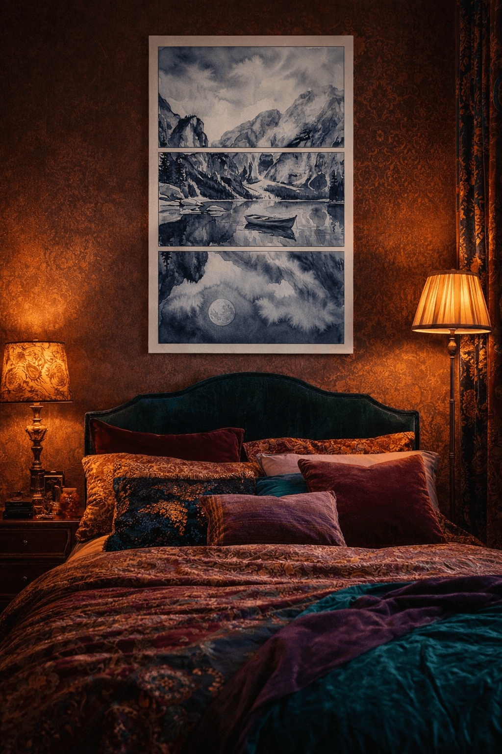
Dense, salon-style arrangements are back—but with a crucial difference from their Victorian predecessors. Today's maximalist walls pair varied frame sizes and art styles with a unifying thread: a consistent color palette, a shared subject matter, or a cohesive frame finish. Think botanical prints in mismatched sizes but unified by black frames, or abstract posters spanning different eras but sharing a warm ochre-and-terracotta palette. The key is controlled chaos: every piece earns its place.
Trend: Mixed Media and Textured Displays
Flat paper prints alone feel one-dimensional in 2026. The most dynamic walls layer canvas prints—which add depth and tactile interest—with traditional posters, creating visual rhythm through substrate variation. A large canvas 20x30 in anchors the arrangement, surrounded by smaller paper prints that echo its colors or themes. This approach works especially well in living rooms and creative spaces where texture amplifies impact.
Trend: Oversized Single Prints as Anchors
Gallery walls no longer require a dozen pieces to succeed. Many designers now build around one statement-scale print—often canvas 24x36 in or larger—flanked by just two to four smaller works. This asymmetrical approach feels modern and breathable, ideal for minimalists who want the impact of a gallery wall without the density.
Myth: Are Gallery Walls Out of Style?
No. Gallery walls remain one of the most versatile, cost-effective ways to personalize a space. What's changed is how we execute them: less matchy-matchy uniformity, more thoughtful curation. A well-planned gallery wall in 2026 reflects individual taste and tells a visual story—qualities that never go out of style.
Tools and Resources to Plan Your Gallery Wall
Digital Layout Generators
Free online gallery wall planners let you input wall dimensions and frame sizes, then drag and drop arrangements until you find a layout that works. Tools like Canva's Gallery Wall Template and Framebridge's Wall Art Visualizer generate scaled mockups you can save and reference during installation. These platforms are especially helpful for visualizing asymmetrical layouts where spacing and balance aren't immediately obvious. Upload photos of your actual wall to see how different configurations look in your specific space before committing to nail holes.
Paper Template Method
The paper template method remains the most reliable low-tech approach: cut paper or newspaper to the exact dimensions of each frame, tape the templates to your wall, and rearrange until the composition feels right. Mark nail positions through the paper, then remove templates and hang with confidence. This tactile process gives you a true 1:1 preview and eliminates the guesswork that causes most spacing mistakes. It's particularly valuable when mixing different sizes—like pairing a large canvas with smaller posters—where visual weight distribution is harder to judge digitally.
Pinterest and Inspiration Boards
Pinterest boards let you collect gallery wall examples that match your aesthetic, room type, and color palette. Create separate boards for layout styles (grid, salon, linear) and room-specific ideas (bedroom, hallway, living room). Use these boards to identify patterns in what you're drawn to—whether it's monochrome palettes, nature themes, or mixed media—then shop accordingly. The visual clustering helps clarify your vision before you start measuring or buying.
Measurement and Spacing Tools
A laser level ensures your top row stays perfectly horizontal, while a measuring tape and pencil are essential for marking the 145-150 cm eye-level centerline. Use painter's tape to outline your gallery wall boundaries and test different widths. For consistent spacing, cut a cardboard spacer to your chosen gap width (typically 5-8 cm) and use it as a physical guide between frames during the template phase.
Ready to Create Your Gallery Wall? Next Steps
You've got the blueprint—now it's time to bring your vision to life. Start by measuring your wall and marking boundaries with painter's tape to visualize the space. Cut paper templates for each piece you plan to hang, then arrange and rearrange them until the layout feels right. This low-stakes rehearsal eliminates guesswork and saves you from unnecessary nail holes.
Gather Your Collection
Browse poster and canvas options that align with your theme and color palette. Mix sizes strategically—use larger canvas prints as anchor pieces and fill surrounding space with smaller posters to create rhythm and balance. Remember: cohesion comes from intentional curation, not uniformity.
Execute with Confidence
Once your templates are taped and your collection is ready, mark nail positions, hang your pieces, and step back. A successful gallery wall isn't built in a day—it evolves as you refine spacing, swap pieces, and add new finds. The key is starting with a solid plan and trusting the process you've learned here.
A gallery wall doesn't need to be perfect—it needs to feel like yours. Whether you've settled on a structured grid, an organic salon hang, or a thematic collection that tells a story, the magic happens when you trust your instincts and commit to the layout. Start with a loose plan, use painter's tape to test your arrangement, and remember that you can always adjust as you go. The wall that feels intimidating today will become the anchor of your space tomorrow—one print at a time. Take what resonates from these ideas, gather the pieces that speak to you, and give that blank wall the personality it's been waiting for.